Posts tagged "travelogues"

Modernity: A Menace or A Promise?

March 29, 2015

Photos and Text by Nikki Boncan- Buensalido (As seen in Urban Monologues v2.0, Business Mirror)


What does it mean to be truly modern? How did modernity come about and how did it evolve in the past century?

My most recent adventure took me to “Fundamentals” the 2014 Architecture Biennale which is currently on display in Venice, Italy.  The exhibition, which runs from July 6 until November 23, 2014 is the 14th international architecture biennale exhibition entitled “Absorbing Modernity 1914-2014” portrays the century that has passed highlighting the influences that changed the parameters of modern architecture.  Some countries were ravaged by war, destroyed, divided, occupied leaving people traumatized yet these countries have survived and have come out stronger.  The exhibitions of the different pavilions from various participating countries show how the elements of architecture have survived and how they evolved to put up with the latest ideas and inventions of their time.    These exhibitions aim to perform an “audit” of architecture and posts questions such as: “what do we have?”, “how did we get here”, and “where do we go from here”.  According to Paolo Baretta, president of the Biennale di Venezia exhibition, the presence of the national pavilions representing 66 countries, show national identity and the country’s ability to become a protagonist in the cosmopolitan world of art and architecture.

The “Elements of Architecture” exhibit curated by well-known Architect Rem Koolhaas offers a new perspective on the elements of architecture that should form the relationship between us- our civilization and architecture. The exhibition compiles a new body of knowledge that explores the often universally mundane parts of a building and highlights its evolution.  The floor, the ceiling, the wall, the roof, toilet, windows etc. are exhibited and broken down into parts and how it was developed over the past century.  With great courage and ambition, Koolhaas mentions that he was able to review the history of modernity in the past hundred years, and offers a new perspective of those “elements” that should constitute reference points for the new architectural prototypes of the next century.  Afterall, these elements, being the simplest parts of a structure will essentially never be removed no matter how the next century architectural models evolve.

As one lands in Venice, the biennale is celebrated everywhere.  The exhibit spaces are divided into three venues and showcase not just architecture but art, dance, film, theater and a music festival as well.  The summer sun complemented the exhibit space at the Giardini Gardens as well as the Corderie dell’ Arsenale grounds where the architecture pavilions were located.  What was effective for this Biennale was that it was truly about architecture and not a tribute to the architects themselves generally making the exhibit communicate in a more universal language.  It highlighted in-depth research, discourse and discussion on modernization of architecture rather than a simple portrayal of various architects’ works which made the experience even more insightful.

Upon disembarkation from the Vaporetto, the taxi boat that takes you anywhere in Venice, we were greeted by a pylon welcoming us to the biennale and signs that led us through the grounds.  Our first pavilion was the Stirling Pavilion which houses an exhibit of the past century’s effect on various countries thereby ‘Absorbing Modernity’.  The pavilions post the question of national identity being sacrificed to modernity as the development of global architectural movements and technological processes took over the once local and vernacular architecture.  It turns out that each country has adapted and evolved from their individual experiences, be it war, new technologies available or natural destruction, etc. to create their own definition of modernity.  Images compiled from various pavilions show how each country has locally adapted to the miles stones of modernity.
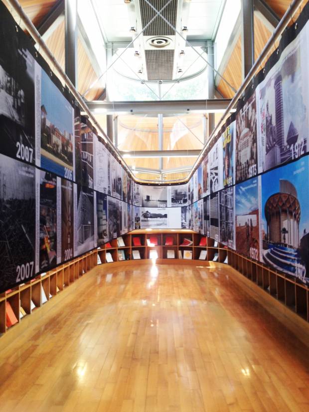
Milestones of Moernity – The Stirling Pavilion houses the exhibit that shows images compiled from different countries on how the concept of modernity has affected their design thinking and their built environment

Rem Koolhaas Exhibition on his “Elements of Architecture” was also top pick on my list of exhibits.  Upon entry of the main gallery, one is greeted by a 1:1 installation of the ceiling.  The exhibit talks about how the modern ceiling has become a faux representation, whose main purpose is to conceal utilities within it, increasing in space requirements over time, effectively decreasing the served spaces below.  It was interesting to see how the utilities were initially placed on the floor early on in the century and how it has technology has allowed us to transform the way buildings and ceilings are constructed.
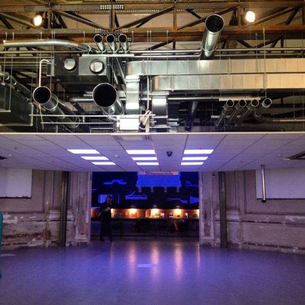
Rem Koolhaas' Ceiling – Rem Koolhaas shows how the modern ceiling has become a faux representation, whose main purpose is to conceal utilities within it, increasing in space requirements over time, effectively decreasing the served spaces below.
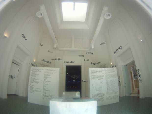
Fundamentals - The exhibition compiles a new body of knowledge that explores the often universally mundane parts of a building and highlights its evolution. The floor, the ceiling, the wall, the roof, toilet, windows, stairs, elevators, etc. are exhibited and broken down into parts and how it was developed over the past century.

Various wall cladding installations were also displayed and Koolhaas was able to show how temperature and climate change affected building systems and how they work.  It made me think of how designers are constantly looking for solutions to improve living qualities and building techniques and how sustainable materials are incorporated more often at this time.  This just goes to show that designers are now more sensitive to climate change and how information has been widely available to the vast majority.  Experimentation and new inventions help push modernity forward keeping building technologies at par with the fast evolving times because of globalization and the internet age.

 Aside from the Central Pavilion where the “Elements of Architecture” were tackled, was caught my attention was the installation of the Architectural Association (AA) Students.  They replicated a 1:1 scaled model of Le Corbusier’s ‘Maison Dom-Ino’ which dates back to 1914. The structure was first designed as a prototype for mass-produced European housing whose design as been iconic images of 20th Century Architecture. “This initial installation will remind visitors not only of modern architecture’s most foundational project, but of an architectural instinct made even more apparent today than it was at the time of its original conception; namely that architecture always operates in the space created by a contrast between architecture as already known, and what it might yet become,” said Brett Steele, AA School Director.
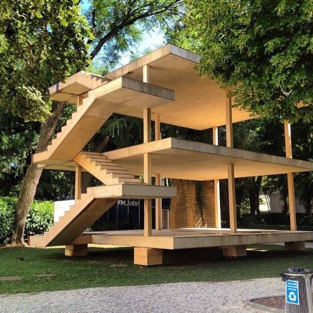
Le Corbusier's Dom-Ino - A 1:1 scaled model of Le Corbusier’s ‘Maison Dom-Ino’ which dates back to 1914. The structure was first designed as a prototype for mass-produced European housing whose design as been iconic images of 20th Century Architecture

The French Pavilion caught my attention because it was challenging the evolution of Modernity as a menace or a promise of a better built environment.  The French have contributed a lot to modernity in terms of architecture and engineering.  The research inside the pavilion questioned if the large scale monotonous housing structures of heavy pre-fabricated concrete panels answered the questions of economic scale or monotony in design and which of these should be taken into consideration more: Design or Utilitarian Function? On the other hand, they also showed how structures like this which were put up in 1942 are now undergoing the process of re-urbanization.

Overall, the Biennale led to me think about how modernization affects those living in this time and age.  A century ago, the concept of modernity was so different from what it is now.  An introspection of the past points out that modernity always had the intention of trying to innovate and trying to improve the way of life through technology and new ideas.  It has challenged us to think of new ways on how to evolve as each generation is an improvement of the former.

In some ways, modernization has also affected our social relationships and how we interact with one another.  Personal touches disappear as one is all too dependent on man made machines. Cultural identities in architecture are less pushed to give way to a standard way of doing things such as pre-fabrication to achieve efficiency. Family communications are now limited as social media through the internet has depreciated one’s ability to personally communicate with another. It could happen that a family lives under one roof, yet they don’t see each other for weeks physically, since they are connected to each other virtually anyway. At the same time, this same technology has allowed information dissemination and new to spread faster and more efficiently.  More people are aware of current state of affairs.

Modernity is positive except that we have to be extra sensitive to what it affects, especially our social and cultural values.  One just has to think of how to balance the menaces and the promised of this new and constantly evolving society.  So to answer the question on whether modernity is a menace or a promise. Well, I guess it can be both.

The Mystery of Stonehenge

June 21, 2014

Text and Photos by Nikki Boncan- Buensalido , As seen in Urban Monologues 2.0, Business Mirror Newspaper (2014)

Welcome to History of Architecture 101. In one of my recent trips, I got to the chance to visit Stonehenge, located in Wiltshire, England amongst the Salisbury Plain.  It is an ancient structure that still boggles the minds of historians and locals alike.  Stonehenge is considered to be one of the wonders of the world and is the best-known, prehistoric monument in Europe.  Its post and lintel construction has paved the way for the modern column and beam type of construction as well as the jointing systems we currently use.

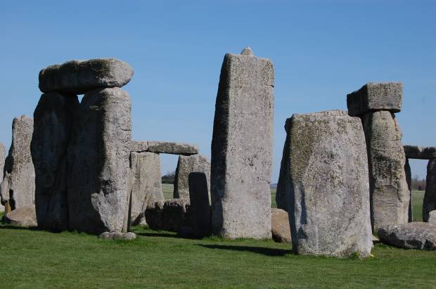
Detail of Tenon and Mortise – The joint systems on the stones were carved out perfectly using deer antlers and bone

Stonehenge’s architecture and methods of construction are basic today but so complex at the time it was built.  It was produced in a culture that left no written records which leads to various imaginative theories.  Historians are still unsure of how the Blue Stones got to where they are now considering that these originated from the Perseli mountain 240 miles away from the current site.  Not to mention that most part of the journey of the 40-50-tonne stones included a trip which crossed waters and scaled a river.  Methods of construction and how the stones were transported, carried, carved, measured and laid out have been studied and theories began to pop up but up to this day, no one knows for sure.  This is what makes Stonehenge so extraordinarily ordinary.

What started out as a simple earthwork enclosure turned out to be the most complex, comprehensive stone structures of the pre-historic times.  It was built in stages that spanned centuries apart in three phases in which all phases required more that thirty million hours of labor.  Historians date the structure back to the late Neolithic period around 2500 BC.  Stonehenge was an important structure in the Bronze Age as later on revealed by the burials mounds surrounding it when artifacts suck as drinking vessels and pottery relating to that period were discovered around the area.

It has been said that Stonehenge was built for various purposes.  One story relates that it was built by aliens because of the way the circles are perfectly laid out.  Others say that it was built by locals who revered the land and used it to be a memorial and a human sacrifice site.  Around Stonehenge to this date, there are hundreds of barrows otherwise known as burial mounds scattered.  This area is considered to be sacred ground as it is a burial site made for the well-known people of the ancient village.  Still others theorize that Stonehenge is an ancient real time calendar laid out in a perfect circle, which maps out seasons, equinoxes and solstices.  Thus it was also regarded as a place of worship and the celebration of the Summer Solstice.

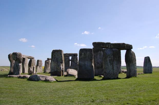
The Stonehenge Circle – The Blue Stones, Heel Stones, Station Stones, Altar Stones and the Five Trilithons of Sarsen Stones is what makes up the circles of Stonehenge. This is the remains of the prehistoric structure to date

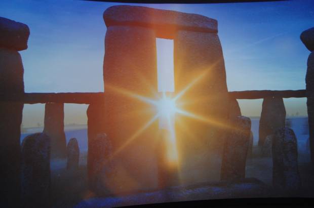
The Summer solstice usually occurs between June 20 and 22.  Also known as the “Midsummer”, it is during this time that the axis of the Earth is tilted toward the sun.  It is also at this point of the year that the sun reaches its highest point in the sky as seen from the north and the south pole. On Solstice day, people in the northern hemisphere experience the longest period of daylight in a year.  In the polar regions however, daylight during the Solstice season is continuous for weeks to even months. People usually flock to Stonehenge at this time of the year because the solstice sun sits perfectly in between the horseshoe shaped stones, other wise known as a trilithon – two vertical stones capped by a horizontal lintel.  In the ancient world, the alignment of the sun to a certain stone marker was a sign that the seasons were about to change or that it was time to plant and harvest crops. On the site even sits an arrow and a Heel Stone marker that points to the true north which probably helped determine how far away the sun was from the north and most likely what season was coming. At summer solstice an observer standing within the stone circle, looking north-east through the entrance, would see the sun rise above the Heel Stone.  What a feeling it must be to witness this natural phenomenon!

Trilithon on Solstice – This is how the Solstice is celebrated every year during the Midsummer festival. The Sun sits directly at the center and in between a Trilithion. This scene informed the ancient people that the Summer Solstice was above head

Today, the government of the United Kingdom has gone through a very extensive program that helps intervene the destruction and decay of Stonehenge for over a period of 5,000 years. Sarsen Stones, Blue Stones, the Trilithons and Heel Stones are typical  parts of the monument.  These stones have various functions and characteristics.  Although some over turned, the government has done a lot to preserve the stones that act as markers and speak a certain language to the prehistoric people.

The Heel Stone and Arrow – The Heel Stone is a single block of Sarsen Stone tilted at 27 degrees, standing near the entrance to Stonehenge. It is a marker that points toward the north-east direction. Notice the arrow that also points to a certain point toward the horizon

What also quite interesting to note is the earthwork, surrounding the Stonehenge, are circular ditches on the earth that seem to close in on the monument.  In the middle of the ditch lies the Stonehenge monument itself. A lot of the stones have fallen and have been eroded but a portion of the structure still stands to tell the story.  What is even more interesting to point out is the impeccable detail that was put in to build the structure.  Locks were carved out on the stones which acted like mortise and tenons joints. To make it fit like a puzzle, some stone had tongue and grooves to their sides which helped the stone stay together longer.    It was very well thought of and perfectly executed.  How this was done so perfectly still remains a mystery to this day.  Local artifacts found on excavation sites reveal that tools such as bone and deer antlers were used to carve out these jointing systems.

I never thought I would set foot on Stonehenge but on that day, oh, how I felt the images of my history books come alive. Images in black and white popped out in full color, my five senses taking in all it could.  I almost didn’t want to take the Stonehenge trip because after all, it was “just a pile of rocks” but after experiencing the place in its context, and listening to the rich history of the place, it was a sight to see.  It was amazing enough to catch my attention during the first day of Architecture History class but it was even more spectacular to see it in person.

I was in awe to see how perfectly laid out the stone were and the details that I was able to take in from that simple piece of construction was well worth the trip.  I can almost imagine how it was like to experience the solstice using this prehistoric calendar.  I am left wondering how it must feel like to be there to witness the sun align perfectly in between the stones and how the prehistoric calendar, dating to about 5,000 years still seems to work without fail.  I intently took a stroll around the whole circle taking in every angle and detail, studying the stones and how they were laid out.  I was so blessed to have experienced this enigma to humanity that has stood out for thousands of years.

Exploring the Urban Fabric

February 10, 2014

Text and Photos by Nikki Boncan- Buensalido , As seen in Urban Monologues 2.0, Business Mirror Newspaper (2013)


Last year, I had the chance to visit Seattle in the US.  My family and I took a 3-hour road trip from Vancouver, Canada to the border of Washington State in the US.  It was my first time in Seattle and I read from books that it was a gloomy city – always raining and cloudy.  Records of the local weather bureau point out that Seattle is ranked as one of the five States that receives the most amount of rainfall in a year.  This was what I was expecting and was prepared to get soaked but as we drove into the border, we were greeted by a warm and very fair day with wisps of clouds in the sky with the afternoon sun preparing to set in the horizon.  It was a pleasant surprise and I was excited because I only had 24 hours to soak in all the Architecture and the local flavor of the City. As dusk set in, we were driving into the curb of the apartment of one of our family friends, Cassie Lim.  Tita Cassie, graciously invited us to stay with her for the night and offered to take us around the city in the morning.

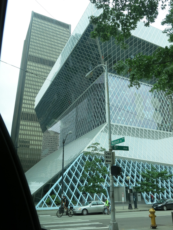
Being an architect, all the items on my Seattle Bucket List were all modern buildings.  After our first stop at the Pike Market to pick up our early morning breakfast at the very first branch of Starbucks, we headed towards the Seattle Central Library which opened in 2004.  The Central Library is the flagship building of the Seattle Public Library System and was designed by world-renowned architect Rem Koolhaas and Joshua Prince- Ramus of the Office of Metropolitan Architecture or simply OMA.  Right smack in the middle of a normal street with normal buildings, was this very expressive art piece.  As you turn the corner, the first glimpse of the building jolts you alive.  An American Institute of Architecture blog notes that this building was voted 108 on the list of Americans’ 150 favorite structures in the US.  The building also received the 2005 National AIA Honor Award for Architecture. At 11-stories of 56 meters high, the building is made of a diagrid structural system, bare concrete and glass.  The building’s massing is composed of a three structures piled, peeled and pulled off from each other in some angles enveloped a structural system that also acts as the skin of the building.  As if inviting users inside, the architects of the building wanted to allow people to still experience how to use books despite the fact that almost anything can be pulled out of the internet.  Koolhaas and Ramus wanted to make sure the program of the building’s spaces functioned as reading nooks and public spaces recreated as a “Living Room” with light filling in from the outside,  encouraging users read more books and stay lengthily inside the library.  The wanted to create a building that was functional and kinetic rather than static and imposing, which is usually how other old libraries look like.

Right smack in the middle of a normal street with normal buildings, was this very expressive art piece.

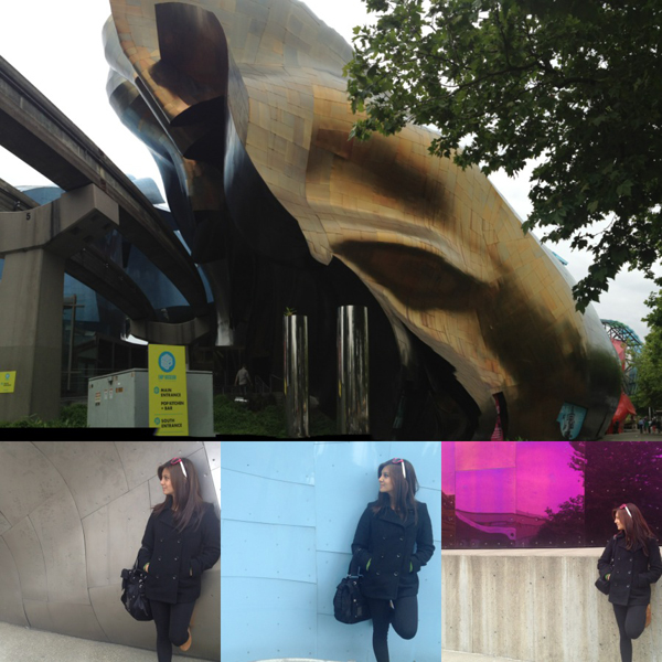
Next stop was the Experience Music Project Museum or the EMP.  The EMP is located in the heart of the Seattle Center Campus where the Seattle Needle can also be found.  The EMP was designed by Architect Frank Gehry. Having been acclaimed for other famous structures such as the Guggenheim Museum in Bilbao and the Walt Disney Concert Hall in Los Angeles, Frank Gehry, another maestro in the world of Modern Architecture.  The EMP Museum is the home to some of the most significant eras of popular culture, science fiction, rock and alternative music.  Similar to its architecture, the museum is dedicated to push risk-taking ideas further so that it can fuel creativity of pop culture further.  The colorful reflective exterior of the building is made up of riveted sheet metal which changes its form as one turns every corner of the building’s façade. Frank Gehry describes the building to take the form of a “smashed up electric guitar”.  Our local guide mentioned that to some local residents, the building is reminiscent of a “crumpled piece of musical score sheet”.  What was interesting too is that the purple side of the structure is inspired by Jimmy Hendrix’s song “Purple Haze”.

Loved the colors all over the facade so I decided to take snap shots in each colored background :)

When I visit architectural landmarks, I make it a point to experience the building on all sides since some have entirely different angles and forms. The details of each particular structure also leave traces as to how the building was constructed and the though process that goes with the design concept. At every turn, the building contorted, bent and cracked to form crevices some of which formed pedestrian entrances and display boards.  There was even a hole in the building to allow the monorail track to slice through!

Sufficient to say that truly, creativity has no limits. Both the Seattle Public Library and the Experience Music Project Museum are notable landmarks in Seattle.  Both carry a distinct identity.  Both are avant-garde, modern and contemporary. The concept of reading and appreciating music is not a new thing.  The Seattle Public Library and the EMP Museum has just found new ways to allow the user to experience reading and listening to music in a new light.  These two buildings have successfully bridged the gap for the elderly and the young by introducing a new and tangible experience.  Both architects used normal elements such as books and music that we are all used to and translated them into something relevant for the current times.  They were able to translate it into something that the younger generation can understand.

Taking these into our local context, I hope that someday, we too can create modern buildings that are responsive to local context and local culture but at the same time these buildings may also allow our people to experience the mundane things in different ways. Allowing them to expand their knowledge based on personal experience is a more effective tool. I invite you to join me as I explore the adventure of life and as I relate a series of observations to dissect what the Urban Fabric contains and to go deeper than just mere aesthetics.

A Symphony of Steel and Stone : The Getty Center

March 4, 2012

(As seen in Urban Monologues, Business Mirror Newspaper, 2008) Text and Photos by Jason Buensalido

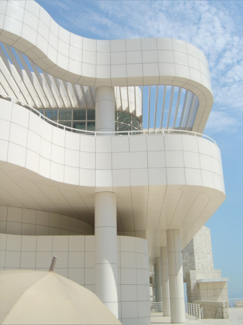
It is hard to miss the Getty Center in Los Angeles, California. I remember when I was driving along the San Diego hi-way to see it for the first time – the moment I saw a cluster of stark, white buildings on top of a hill, I knew that was it. Even though its dominant color is not close to any earth tone, the complex still appears as I it grew out of the site. The buildings are organized and massed in such a way that they almost follow the natural contours of the hillside that it is perched on. From a centralized parking area, I was taken to the top of the hill by a computer-operated tram. At the central arrival plaza, the whole symphony of Meier’s travertine and aluminum buildings could be better appreciated while enjoying breath-taking panoramic views of the city.

The Getty Center is comprised of the Getty Conservation Institute, the Getty Education Institute for the Arts, the Getty Grant Program, the Getty Information Institute, the J. Paul Getty Trust, the Getty Research Institute for the History of Art and the Humanities, the J. Paul Getty Museum, an auditorium, central garden, and several cafes and restaurants. All these buildings are organized along a natural ridge on the hilltop and around a series of courtyards and terraces. The vicinity is surrounded by high-end subdivisions with powerful people living in them. They requested that all the structures in the complex be no more than two stories high so the buildings won’t appear as if they were towering over their residences. The need for space was answered by extending the buildings underground and linking them with subterranean corridors that facilitate the moving of artwork and other materials.

The buildings are organized by a perfectly oriented north-south grid with a 3ft by 3 ft module, which clearly expresses the cubist beliefs of Meier. The museum is divided into five galleries or buildings, called pavilions, are North, East, South, West and the Changing Exhibit pavilion. These pavilions are clustered around a central courtyard. Though these five galleries are all connected by glass-covered bridges which make the transition from gallery to gallery easier, the visitor still has the option of coming out into the courtyard to skip a gallery and move on to his preferred one. The visitor therefore has freedom to move about the galleries in whatever sequence he wishes, unlike most museums, where people are required to take the prescribed flow.


The characters and shapes of the different buildings of the Getty Center.

The artwork is displayed throughout the pavilions chronologically: the North houses the oldest art while the West houses the newest. The first floor galleries house light-sensitive art, such as illuminated manuscripts, furniture or photography. Computer-controlled skylights on the second floor galleries allow paintings to be displayed in natural light.

To the west of the Central Garden is the Getty Research Institute (GRI). This circular building is used primarily by Getty scholars, staff, and visiting researchers. The library evokes the introspective nature of scholarly research, with book stacks and reading areas wrapping around a central courtyard. A ramp creates concentric paths, promoting interaction among the scholars and staff. A skylight pulls light through to the subterranean reading room. At the plaza level, a small exhibition gallery displays objects in the GRI’s collection for visitors.

To the north and east of the Arrival Plaza are the Getty Grant Program, the Getty Conservation Institute, and the J. Paul Getty Trust administration offices. Intimate sunken gardens, terraces, glass walls, and open floor plans provide fluid movement between indoor and outdoor space, and views of Los Angeles for Getty staff.

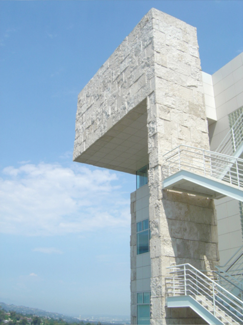
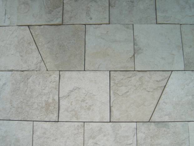
One of the most remarkable elements of the complex is the travertine stone that was used to clad most of the buildings. 16,000 tons of stone were quarried from Tivoli, Italy, 15 miles east of Rome. They claim that this is the same kind of stone the Romans used to build the Coliseum. To make the complex different, Meier and his staff worked for a year with the quarries to invent a process using guillotine to produce a unique finish.

TRAVERTINE STONE CLADDING - 16,000 tons of stone were quarried from Tivoli, Italy, 15 miles east of Rome. They claim that this is the same kind of stone the Romans used to build the Coliseum. To make the complex different, Meier and his staff worked for a year with the quarries to invent a process using guillotine to produce a unique finish.

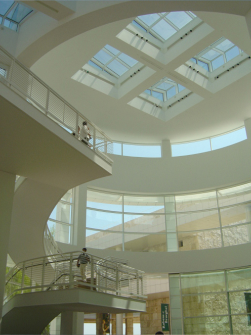
Meier has also been known for his expert use of natural light. The many exterior walls of glass allow sunshine to illuminate the interiors. A computer-assisted system of louvers and shades adjusts the light indoors. The galleries of paintings on the Museum’s upper level are all naturally lit, with special filters to prevent damage to the artworks.

USE OF NATURAL LIGHT - exterior walls of glass allow sunshine to illuminate the interiors. A computer-assisted system of louvers and shades adjusts the light indoors.

To me, The Getty is certainly one of the best designed museums in the world with its interior ambience that is perfect for appreciation of art, its lay-out which allows an efficient flow of visitors, and the placement of buildings which creates exterior public spaces that blend seamlessly with the landscape.

You may e-mail the author at design@buensalidoarchitects.com and visit his website at www.buensalidoarchitects.com


Shanghai World Expo 2010

March 3, 2012

(As seen in Urban Monologues, Business Mirror Newspaper; Text and Photos by Jason Buensalido)

In 2005, I went to Shanghai under the First Philippine – China Youth Ambassador Program. During that time, I was made aware of the plans of China for the future. We were brought to the Urban Planning Exhibits of both Shanghai and Beijing where we saw how they were planning to announce to the world through urban design and architecture, how they have become the new super power.

Part of that plan was to host the coming World Exposition in 2010, so when I realized that it was nearing completion early this year, I told myself that I had to see the built form of the drawings and plans that were shown to me 5 years ago.

The World Expo 2010 is currently being held on opposite banks of the Huangpu River in the city of Shanghai, China, and will run only until October 31, 2010. The theme of the exposition is “Better City – Better Life”, signifying Shanghai’s new status in the 21st century as the “next great world city“. This is also the reason why I was so attracted to go – its because the theme of the whole expo is geared towards architecture and urban design.

People say that “everything in China is big”, and the stats of the expo simply reinforce this fact. It is the most expensive Expo in the history of the world’s fairs, and the largest as well, occupying a vast land of 5.28 square kilometers. It is the also the expo that is widely participated, with over 190 countries and 50 international pavilions present. More than 70–100 million visitors are expected to visit the expo, which would again, make it the most visited in history. After winning the bid to host the Expo in 2002, Shanghai began an enormous undertaking to reshape the city. More than AU$48billion was spent for the preparation, more than the cost of cleaning up Beijing for the 2008 Olympics. Shanghai was able to clear up 2.6 square kilometers along the Huangpu River; causing that involved moving 18,000 families and 270 factories, and 10,000 workers to be move elsewhere. Six new subway lines have opened between 2008 and 2010. Four thousand brand new taxis have been added in the month preceding Expo2010 opening. The city night lights have been once again improved, using energy-saving LED technology – all the structures on all of the main roads leading to the Expo are all beautifully lit, enhancing the anticipation of the Expo experience.

At the center of the entire expo site is the main building. Called the “Expo Axis“, it has world’s largest membrane construction and was built by SBA architects and Knippers Helbig. The building consists of columnar steel and glass funnels with a 1,000 m long membrane construction.

There are different pavilions scattered throughout the expo. First is the Theme Pavillions, exploring and showcasing different possibilities of sustainable urban development. They are called Urban Footprints, Urban Planet, Urban Dwellers, Urban Beings, and Urban Dreams.

There are also the Corporate Pavillions, which are different companies that sponsored and would also want to announce their sustainable practices. These include Broad Pavilion, China Railway, China State Shipbuilding Corporation Pavilion, Coca-Cola Pavilion, Cisco Pavilion, Information and Communication Pavilion, Oil Pavilion, Japanese Industry, PICC, Private Enterprises Joint Pavilion, Republic of Korea Business, SAIC-GM Pavilion, Shanghai Corporate Joint Pavilion, Space Pavilion, Space Home Pavilion, State Grid, and Vanke Pavilion

What caught my interest though, are the national pavilions. Each participating country designed and constructed their own pavilions, highlighting their own culture and own urban proposals. As I mentioned earlier, there were about an abundant number of international pavilions, which was almost like going around the world within a few square kilometers. I wasn’t able to go inside all as one would have to fall in line for as much as 4 hours just to get inside the famous ones. But fortunately, with the help of my able body and passion for design, I was able to walk the entire site and see them all, even from the exterior. It was a such a wonder to see the latest design trends all over the world all in one place. The challenge for most of the designers for the pavilions was how to come up with a forward-looking architecture that would represent the principles of urban design, modernism, and sustainability, while keeping in mind that the structure is a temporary one, to be torn down after six months. What I noticed is that most of the pavilions were able to do this by the usage of “skins” – an architectural covering that is detached from the main structure of the pavilion. By doing this, the exterior nature of the pavilions can be designed to be so complicated, while the structural components can be kept straightforward.

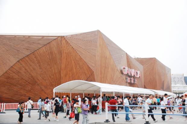
One of the biggest one I saw was the 6,000-square-meter Canada Pavilion, among the biggest at the site, will feature an exhibition themed “The Living City: Inclusive, Sustainable, Creative.” The pavilion wraps around an open public plaza which doubles as a performing area, where visitors can watch the performances of Cirque du Soleil while in line to go inside. Its structure is wrapped with a slatted wooden skin, arranged in a facetted manner.

canada pavillion

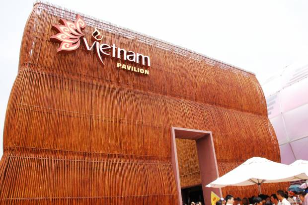
The Vietnam Pavilion could very well be mistaken as the Philippine Pavilion. From afar, it has a very simple box-like profile, but upon close inspection, it is actually covered with interwoven bamboo poles that achieve a very expressive cultural character.

vietnam pavillion

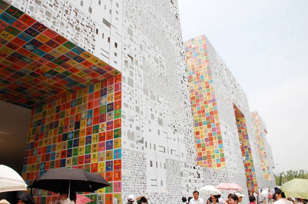
The concept for the Korea Pavilion is an amalgamation of ‘sign’ (symbol) and ‘space’: Signs become spaces, and simultaneously, spaces become signs. The exterior surfaces of the Korea Pavilion are clad in 2 types of pixels: Han-geul Pixels and Art Pixels. Han-geul Pixels are white panels with a relief of letters in four different sizes whose combination forms the majority of the exterior, mainly the peripheral surfaces. Most of the non-peripheral surfaces are composed of Art Pixels, which are 45cm x 45cm aluminum panels created by a Korean artist, Ik-Joong Kang. About 40,000 of these panels texturize the façade, contributing a bright palette of colors, hope, and unity throughout the Korea Pavilion. The surfaces will project different atmospheres during the day and night, with light and shadows creating different textures. Sequential lighting is installed behind the Hangeul Pixels to highlight the individual letters on the exterior façade at night, further animating the pavilion as a sign (like a text message) on a larger scale.

korean pavillion

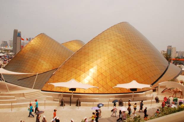
Foster + partners designed the UAE Pavilion based on the shape of sand dunes in reference to the symbolic feature of the desert landscape shared by all seven emirates. The peak rises to 20 meters in height and it is entered via a glazed lip at the pavilions base. light penetrates the building’s business center and VIP area through glazed vertical strips which illuminate the pavilion from  within by night. Its exterior is clad with a tessellated triangular panels that seem like gold, symbolizing the surge of wealth that the UAE has experienced.

United Arab Emirates Pavillion by Norman Foster

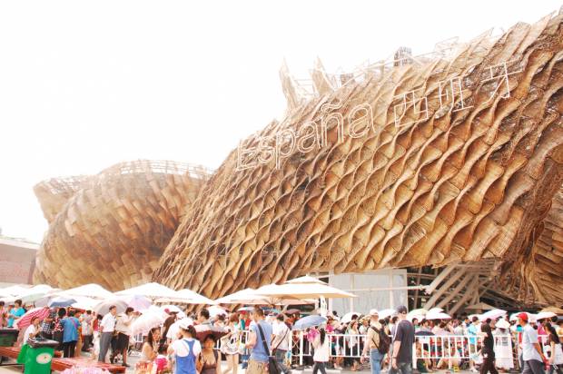
The Spanish pavillion is one of the most surreal pavillions present. From afar, it seems to take the shape of the Guggenheim museum in Bilbao, but instead of being clad in titanium panels, this one is clad with hand woven layers of wicker, each with a different pattern.

Spanish Pavillion

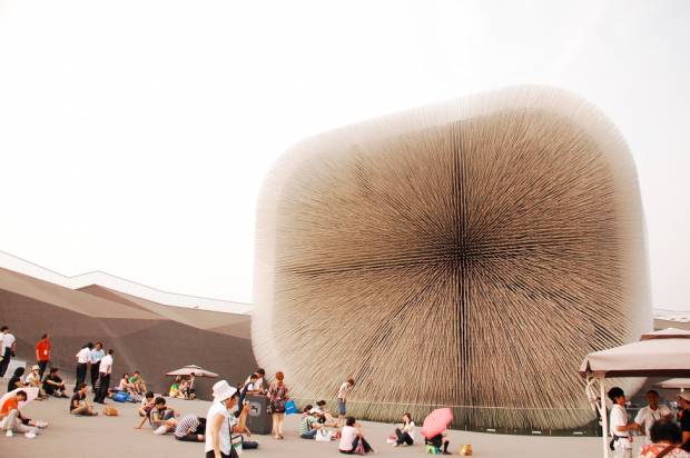
The UK Pavilion’s required the involvement of the Kew Gardens ’ Millennium Seedbank whose mission is to collect the seeds of 25% of the world’s plant species by 2020.
 The design process evolved to produce two interlinked and experiential elements: an architecturally iconic Seed Cathedral, and a multi-layered landscape treatment of the 6,000m2 site. The Seed Cathedral sits in the centre of the UK Pavilion’s site. It is about 20meters high and is formed from 60,000 slender transparent fiber optic rods, each 7.5 meters long and each encasing one or more seeds at its tip. During the day, they draw daylight inward, illuminating the interior of the space. At night, light sources inside each rod allow the whole structure to glow. These rods are also tectonic, gently moving as the wind blows, creating a dynamic effect.

UK Pavillion by Thomas Heatherwick

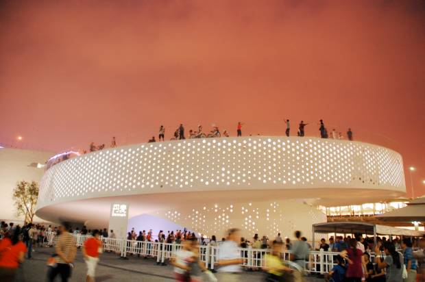
My favorite pavilion is the Denmark Pavilion by B.I.G. Architects. For me it is the pavilion that exudes the least effort to be beautiful. Basically, the pavilion is a double helix ramp, a big loop on which visitors ride around on one of the 1,500 bikes available at the entrance, a chance to experience the Danish urban way. At the center of the pavilion there’s a big pool with fresh water from Copenhagen’s harbor, on which visitors can even swim. At the center of the pool you will find The Little Mermaid, a statue that has become a symbol for Denmark (pretty much how Rizal in Luneta is to us). And this time, it will be moved temporarily to China. In Bjarke Ingels’ (the architect) words “it is considerably more resource efficient moving The Little Mermaid to China, than moving 1.3 billion Chinese to Copenhagen”.

Danish Pavillion by B.I.G. (Bjark Ingels Group)

The pavilions are simply too many to be mentioned in this article. For me, it was an architectural smorgasbord that allowed me to see the trends that are happening all over the world. The experience of the expo would be different for each person. There are simply too many reasons not to go and see the Expo. I personally doubt that an exposition of this magnitude will be repeated in the near future so I personally advice everyone to go the Shangahi and take a trip around the world in 5.28 square kilometers.

You may e-mail the author at design@buensalidoarchitects.com and visit his website at www.buensalidoarchitects.com

THE BIRD’S NEST: Beijing’s National Stadium

March 3, 2012

(As seen in Urban Monologues, Business Mirror Newspaper. Text and Photos by Jason Buensalido)

In the book “The Alchemist”, the author talks about personal legends which are essentially a major goal of foremost significance that one wishes to achieve in his or her lifetime. For me, my standard answer whenever asked that question would be “To design a piece of architecture that would represent today’s civilization.” Just like how the Eiffel Tower, the Pyramids of Egypt, or even as simple as the Parthenon in Greece, all these structures have been significant in understanding of world’s past as lessons about culture, social beliefs, religion, and even technology are learned from them. I hope that one day, I would be able to make the same mark in our country. I dream of building something that would help people in the future understand who we are as a country today, very much like how the Bird’s Nest in Beijing represents the status of its nation now.

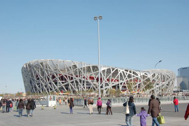
The Bird’s Nest, or the National Stadium, was the main venue for the 29th Olympic Games held in Beijing, China. It is a structure of utmost significance not only because all eyes all over the world were on it during the Olympics, but because it projected an image of such advanced development, willpower, and confidence for China. Personally, seeing it was very momentous as it is one of the most contemporary pieces of built architecture in the world and was a source of education and inspiration for me as I am a modernist myself.

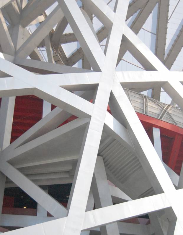
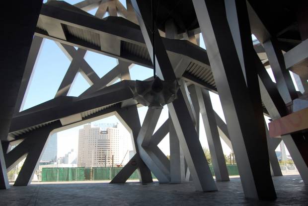
NEST-LIKE APEARANCE - The roof is suported by twenty-four trussed columns that is camouflaged by seemingly random steel lattice-work , forming the over-all esthetic of the “nest”. A common misconception is that the placement of the steel frames of the nest is random and has no purpose, when in reality, each half of the stadium is nearly identical and each steel frame in the nest helps the other structural elements support each other. Due to the stadium's resultant appearance, it was nicknamed "The Bird's Nest".

I have been reading about this structure as early as 2003 before the Olympic Games made marketing noise. After being awarded the right o host the Olympic Games in 2001, Beijing knew that it would take a lot of time, efforts, and processes to build a world-class stadium. That is why they started with a bidding process right away for the design of the structure, with multiple parameters such as a retractable roof, low maintenance costs, and flexibility for post-Olympic use. Thirteen Entire were short-listed, and out of this thirteen, the consortium of Architects Herzog and De Meuron, China Architecture  Design and Research Group (CADG), and artist Ai Weiwei, emerged as the winning entry.

close-up shot of the NEST

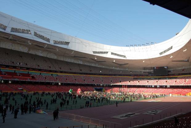
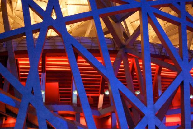
The concept of the stadium originates from Chinese ceramics which had very parallel characteristics with how they wanted the building to be –  a “porous” stadium and “a collective building or a public vessel”. This led the team to a “nest scheme”. The stadium consists of two independent structures – a red concrete seating bowl and the outer steel frame around it. They stand about 50 feet apart from each other, forming an interstitial space that serves as the perimeter circulation space.

The interstitial spaces between the red bowl for seating and the secondary steel nest serve as the circulation spaces.

Much of the character of the stadium comes from the secondary steel nest that encapsulates the inner red bowl. As one of the requirements for the design was to have a retractable roof, the designers’ solution was twenty-four trussed columns that each weighed 1,000 tons. To camouflage these steel supports for the retractable roof, the team developed the seemingly random steel lattice-work to blend the supports into the rest of the stadium, forming the over-all esthetic of the “nest”. A common misconception is that the placement of the steel frames of the nest is random and has no purpose, when in reality, each half of the stadium is nearly identical and each steel frame in the nest helps the other structural elements support each other. Due to the stadium’s resultant appearance, it was nicknamed “The Bird’s Nest”.

But just like any other construction job, misfortunes happen. During the construction of the stadium, a portion of the roof of  the Charles de Gaulle International Airport collapsed. Its designer, French architect Paul Andreu, was also designing the National Theatre nearby, which led Beijing to review all major projects. They decided to eliminate the retractable roof, the original inspiration for the “nest” design, as well as 9,000 seats from the stadium, for safety and budgetary reasons.

view of the stadium interiors, without the retractable roof


In line with the theme “Green Olympics”, the stadium also has eco-friendly features. A  rainwater harvesting system was integrated near the stadium which essentially collects rainwater and is used for non-potable purposes throughout the stadium after a purification process. For thermal insulation, the designers placed pipes under the playing surface that gather heat in the winter to warm the stadium and coldness in the summer to cool the stadium.

The stadium’s design originally called for a capacity of 100,000 people; however 9,000 were removed during a simplification of the design. The new total of 91,000 would be shaved further when 11,000 temporary seats were removed after the 2008 Olympics; bringing the stadium’s capacity to 80,0000. The farthest seat is 460 feet (140 meters) from center field.

One measure of how well an Olympic structure is designed is how it is going to be used after the Olympics. As for the case of Bird’s Nest, it will continue to be a host to a multitude of events after the games. Immediately after the main Olympics, it hosted the opening and closing ceremonies and athletic events of the 2008 Summer Paralympics in September 2008. In 2009, the stadium will host the It alian Super Cup finals – the traditional curtain raiser to the Italian soccer league season. Though designed for track & field events of the Olympics, the stadium will continue to host sporting events, such as football, afterwards. A shopping mall and a hotel, with rooms overlooking the field, are planned to help increase use after the Olympics. The designers envision this structure to be the most important public space in Beijing.

I was lucky enough to get a seat in a sports bar in Makati to witness the opening ceremonies of the Olympics live. I was able to watch the full coverage of all the grandiose and magnificence of the ceremonies. The Chinese grabbed this opportunity to show off how talented they are in the fields of dance, song, use of technology, and fireworks. The show was so moving and extravagant that even London already admitted as early as now that they will not be able to parallel the Chinese’s show of talent. In the midst of all of these, the Bird’s Nest was the backdrop. I was imagining at that point that all eyes all over the world were on the structure, appreciating and marveling about how significant the structure is and what it represented. I wish that one day; I will be given the same opportunity to design such a structure, ultimately achieving my personal legend.

close-up at night