THE STORY OF THE THE SYDNEY OPERA HOUSE

August 21, 2012

Text and Photos by Jason Buensalido , As seen in Urban Monologues, Business Mirror Newspaper (2007)


“Jorn Utzon, the architect of the Sydney Opera House, has never seen his masterpiece in the flesh since he left Australia in 1966.” said our animated tour guide. As if the design of the structure wasn’t interesting enough, I found out that the history of the building’s construction was even more colourful.

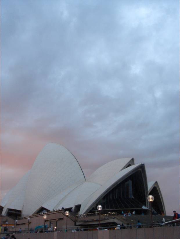
I recently took a trip to Australia where I felt like I was on another architectural pilgrimage. Any architect you talk to knows what the Sydney Opera House is, so it would be a shame if I didn’t see it with my own eyes. When I did, I didn’t realize that my jaw was dropped because the sight of the magnificent structure. It moved e, causing me to just stop and gaze in awe.

The idea of having an opera house in Sydney formed in the 940s, when a world-class visiting conductor came to the city to do a performance. He was able to talk to the city officials and told them that if they wanted to be a serious metropolitan, they needed to have a place where culture can flourish; they needed an opera house.

The visiting conductor probably hit an insecure nerve among the city politicians because after he left, they organized an international competition for the design of the Sydney Opera House. It was a very prestigious and high-profile competition, as over 200 entries were submitted from all over the world.

The entry of Jorn Utzon was already thrown in the trash can. Majority of the judges said that it was too different and too bold to be the new face of Sydney. Luckily, there was one judge who came in late and saw the entry in the can. He picked it up, spread it out, and showed it to once again to the other judges – “This should be our winner PRECISELY because it is different!”. Jorn Utzon, an unknown Danish architect, won 5000 dollars and the commission of the project. He moved his entire family to Australia and set up an architectural office there to oversee the construction of his work.

Originally, the budget for the opera house was 7-millon and the timeframe for construction was 7-years. What happened was it took 14 years to build, and about 102-million, which is about 1.2 billion today.

Naturally, the people of Sydney reacted during the course of construction. They started complaining that their tax money was being spent unnecessarily to build an opera house that they didn’t need in the first place. “We’re laid back people. We’re a country who loves the outback! We don’t need no opera house !”, I can almost imagine them say back in the 50s. The officials, since they wouldn’t take he blame themselves, they blamed the architect, Jorn Utzon. They tried to take him out of the picture and cut him out from the team to the point that he wasn’t being paid his salary anymore. Finally, in 1966, Jorn packed his bags and went back to Denmark with his family, giving up the fight for his masterpiece.

When he did, an Australian architect was asked to take his place. The Australians didn’t know anything about designing opera houses, so they were sent around the world for three years to study the design of different opera houses. They finished the  opera house on October 20, 1973 and was opened by no less than Queen Elizabeth herself.

The design of the building is very interesting as well. When Jorn Utzon was conceptualizing for the competition, nothing was coming into his mind. Luckily one morning, he was simply peeling an orange when he realized that the forms of his design could actually be derived from his breakfast! He then cut different triangular shapes from the orange’s sphere and put it together to come up with the final design of the opera house, calling it his ‘spherical solution’. Maybe architects should eat while designing too. You’ll never where you might get inspiration from.
The design of the Sydney Opera House was derived from triangular sections of a sphere. The architect was eating an orange one morning when he suddenly thought of a ‘spherical solution’.

The Sydney Opera house is consisted of three sail-like structures sitting on a podium. The smallest structure is a restaurant, and then the two are performance halls. The sails have a very modern sculptural quality and it makes you wonder how they were able to put together a structure as complicated as that way before computers. The sails are made of pre-cast panels held together by tension rods throughout the hollow portions of the structure. They say that the opera house has more steel than the Sydney Harbour Bridge nearby. The structure was actually put together like LEGO, the famous toy product which incidentally is from Denmark as well.

One would think that the exterior of the performance halls were purely white. But upon closer inspection, I found out that it is finished with tiles with 3 shades – off-white, cream, and beige. This makes sense because if it were too white, the structure would be too glaring. The tiles are triple glazed, which made the opera house one of the first self cleaning buildings in the world. The dirt from its surfaces simply creeps down to the drains whenever it rains. Meant to look like giant fish scales, Utzon got his inspiration form Moroccan buildings which are usually clad with tiles.
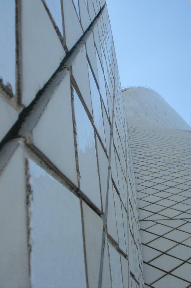
The surfaces of the opera house are clad with tiles of 3 shades – off-white, cream, and beige. The tiles are triple glazed, which made the opera house one of the first self cleaning buildings in the world. Meant to look like giant fish scales, Utzon got his inspiration form Moroccan buildings which are usually clad with tiles.

The first among the two performance halls is fondly called the black theatre because of its interiors, and is the smaller one between the two. It is an opera and a ballet theatre, with a backstage that can be lowered two levels down. That is where the sets are changed, since the space on the stage level is too small. In reality, there are a lot of flaws in the black theatre, and that is why it is due for a renovation soon, with a budget of 500 million.

Then we proceeded to the bigger performance hall. I thought that I had my share of awe that day, but I was further moved by the design of the interiors of the second hall. It had a soaring ceiling with a shape that seems to spring from the ground, changing and morphing into different configurations as it goes up. Unlike the other theatre, this one doesn’t have a proscenium. There are seats even at the back of the stage. There is no need for microphones during performances at this theatre because the combination of hardwood and softwood used for the interiors bounce all the sound coming from the stage back to the audience. The organ is equally impressive. It is the biggest mechanical organ in the world. It has about 140 pipes, took 10 years to build, 2 years to tune, and cost about 3 million dollars.

The three sail-like structures sit on a podium. Utzon got his inspiration form a typical Mayan temple, where you climb up a long set of stairs to get transported into a different world. In the same manner, going up the stairs of the podium was meant to symbolize your transportation to a world of art and culture, leaving the stresses of urban life behind. The heaviness of the podium also complements the lightness of the sails. This is where all the service spaces such as the practice stages and studios are housed.
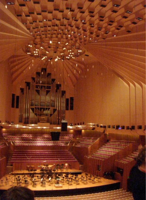
The interiors of the big performance hall had a soaring ceiling with a shape that seems to spring from the ground, changing and morphing into different configurations as it goes up. The author fulfilling one of his architectural pilgrimages

I guess every high-profile structure has its own story. The Eiffel tower and the triangular entrance the Louvre was loathed by Parisians. The Statue of Liberty was rejected by the Americans when it first arrived. The Guggenheim Museums, both in New York and Bilbao, received endless negative criticisms. Now, all these structures are weaved seamlessly into their respective cities. They now stand as the foremost symbol for the people that once rejected them, just like the Sydney Opera House.

“The House” in Philippine Star, August 11 2012

August 19, 2012

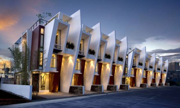
We designed a series of townhouses for DMCI Homes and VConsunji Inc way back in 2009. The Sofia Townhouse, as it was called, was so successful that it was dubbed the “most beautiful townhouse in the Philippines” by some websites.

See design in these links:

http://www.dmci.bobonbeachresort.com/mahogany-place-3-taguig/

http://www.buensalidoarchitects.com/projects/sofia-townhomes-dmci-homes/

Perhaps that was because in 2008, Buensalido+Architects bagged the first prize in a national competition called “Ang Pinakamagandang Bahay Sa Balat Ng Lupa” (The Most Beautiful House on the Face of the Earth) against over 40 other architectural firms.

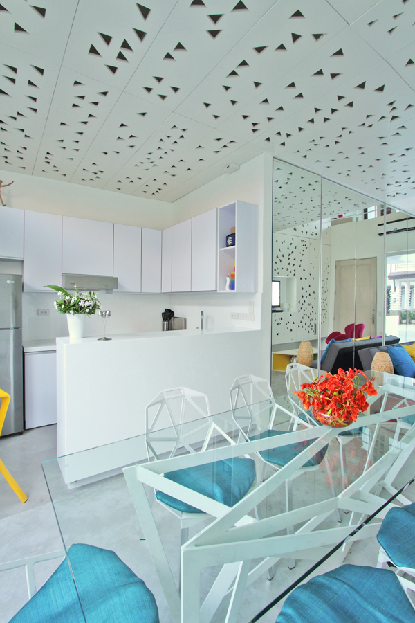
The interiors for this townhouse is a tribute to the Filipino spirit. As we constantly push for contemporary Filipino architecture, we found the aesthetic expression of this design intent through triangles, an abstracted representation of banderitas (or flaglets) that one would commonly see in local fiestas and festivals. As a country, the Philippines has one almost every day.

The Living Area

The Dining Area

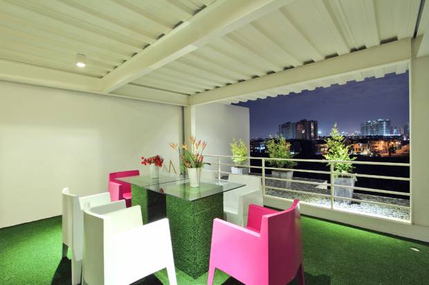
The Deck, with the Fort Global City Skyline

It is a manifestation of the Filipino’s optimism and positive outlook in their lives, always knowing how to smile no matter how bad their situation is. This was captured with the different bursts of colors within the house, achieving a sense of vibrancy, festivity, and positivity.

These conceptual ideas were physically implemented in a contemporary and innovative way: the banderitas and triangles on the interior surfaces were achieved with a CNC milling machine, therefore attaining precision in its production and avoiding human error. Light fixtures were located above the cutouts, creating an ever-changing pattern of shadows, depending on how many lights are turned on. A certain kind of material honesty was aimed for, so for the concrete flooring for example, was kept as is, applying a special kind of lithium-based sealant to achieve a smooth, terrazzo-like effect.

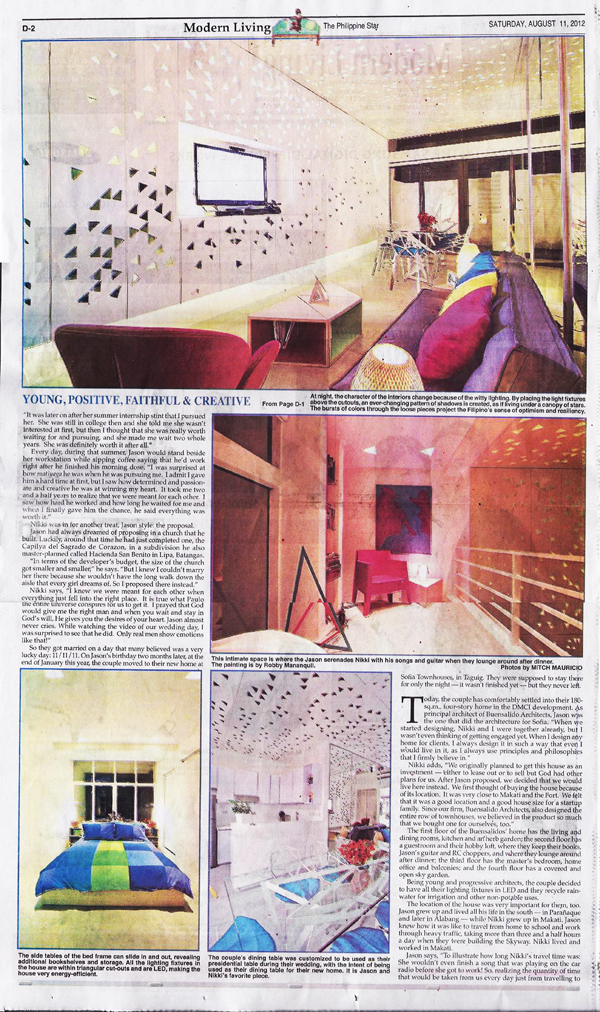
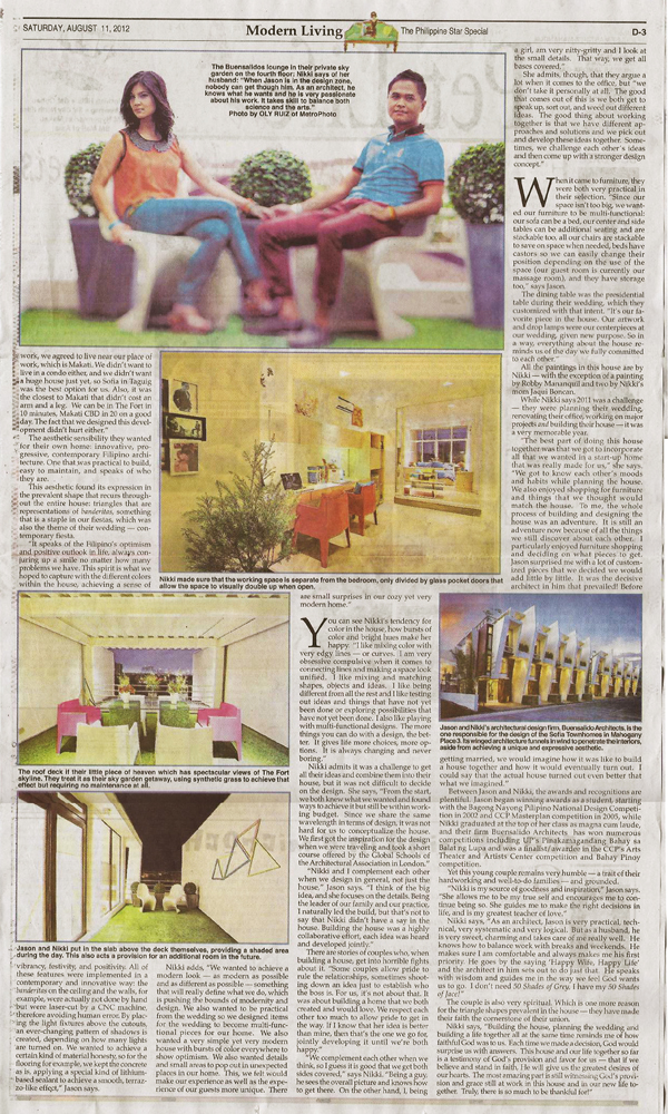
THE HOUSE was featured in the Philippine Star, a national daily broadsheet in the Philippines, in it’s Modern Living section. Tanya Lara captures the story of the owners and interiors of the house in her article, Crazy Quilt.

Online version here - http://www.philstar.com/Article.aspx?articleId=836712&publicationSubCategoryId=85

Thank you so much Tanya, and to the Philippine Star! :)

page 1 of philippine star, modern living section

full spread - first half

full spread - second half


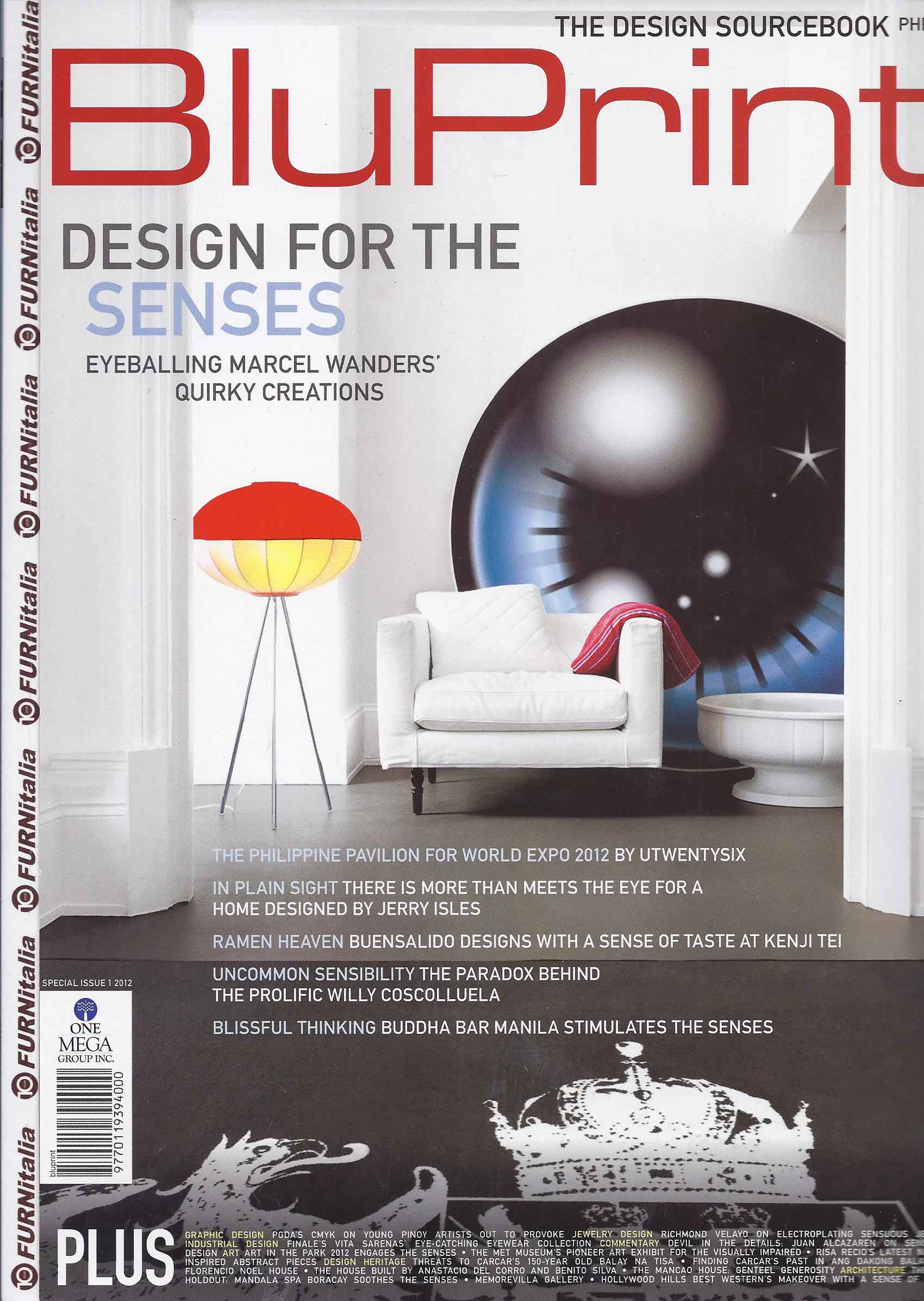
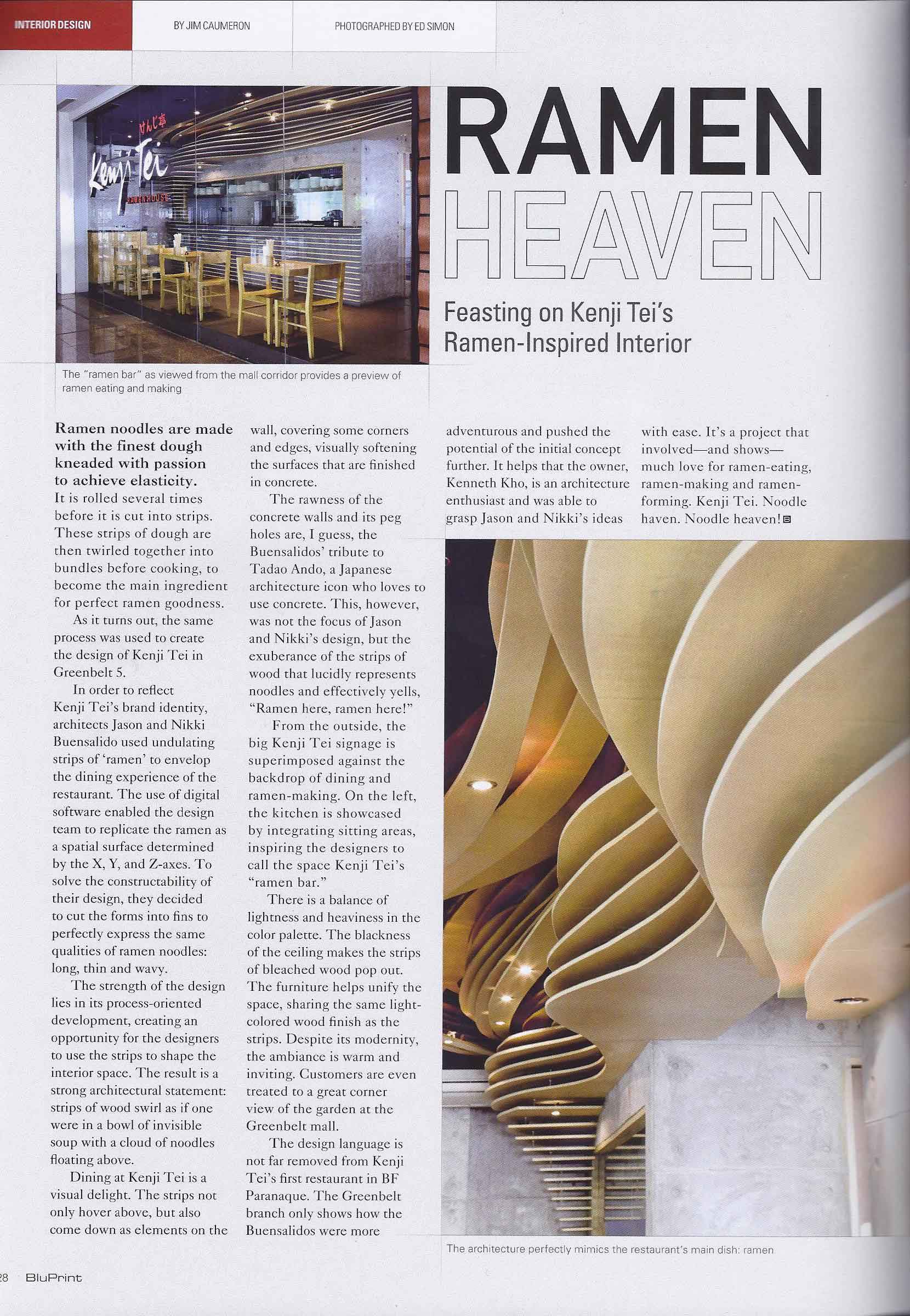
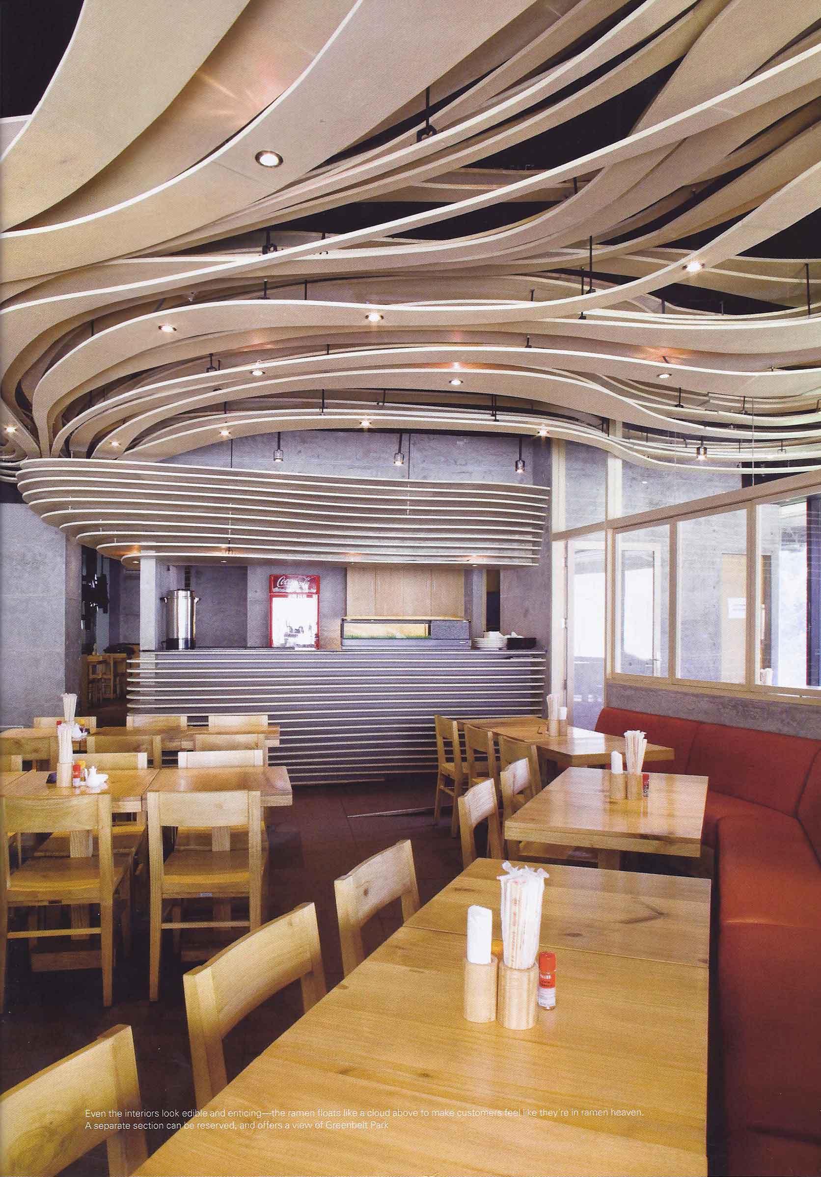
Kenji-Tei Greenbelt 5 at BluPrint May 2012

May 4, 2012

BluPrint Magazine, one of the firm’s favorite magazines, features Kenji-Tei Greenbelt 5 in their Interiors section. The shoot and interview were done simultaneously a few months ago with Asst. Editor Gaby Alegre, photographer Ed Simon (who took the spectacular twilight photo of our chapel project  in Batangas that made the cover of BluPrint as well), and Jim Caumeron. Ken Kho, our friend, maverick restaurateur and owner, was of course there as well.

We had to schedule it at 730 in the morning because everybody’s schedules wouldn’t meet and that was the only time everyone could be there at the same time. It actually worked well especially for the shoot because the reflections of the other store’s signages weren’t visible in our storefront shot, and the morning light penetrated the interiors beautifully.

Here’s how the feature looks like:

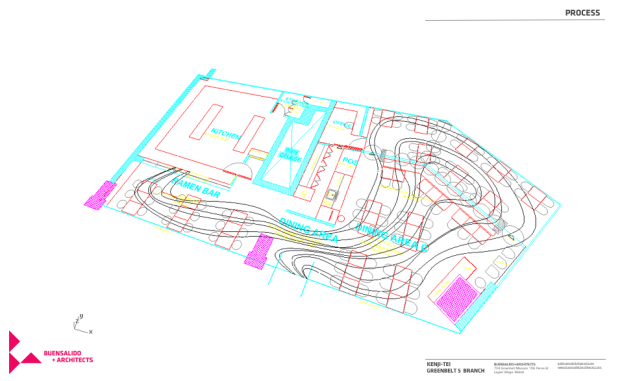
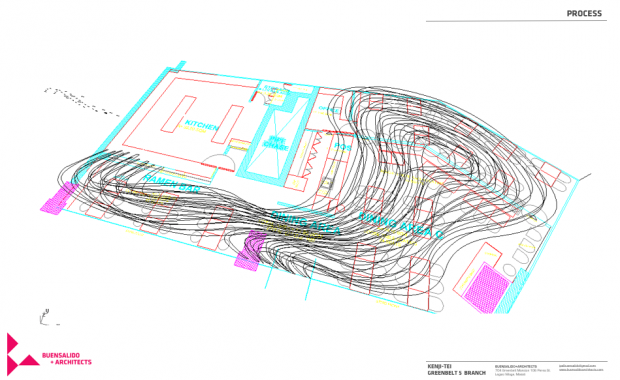
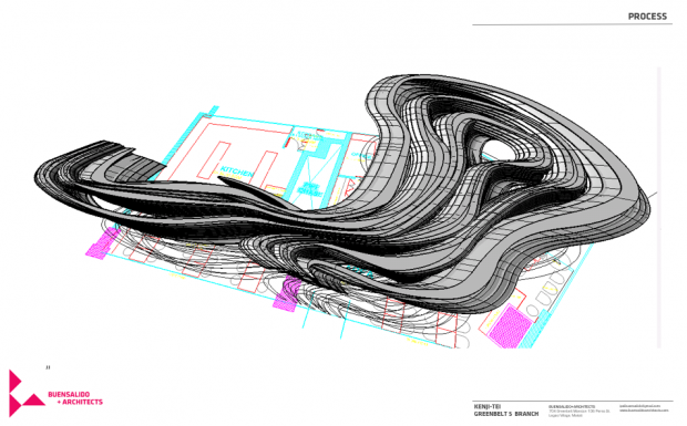
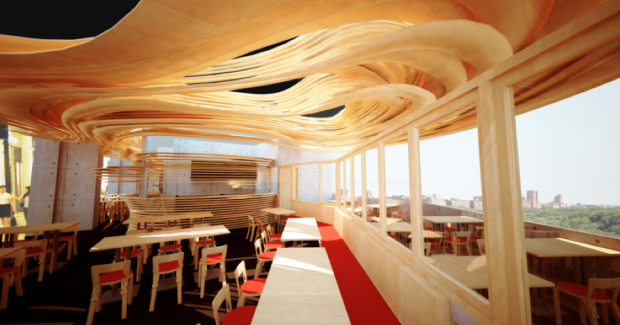
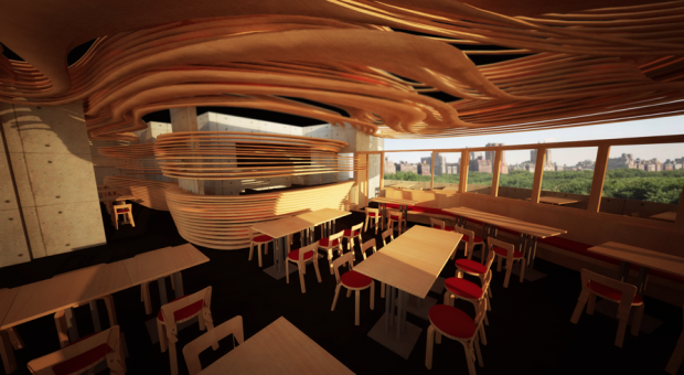
Some process diagrams and original renderings of the ramen house:

original renderings - showing dining space and function area

original rendering - dining area towards sushi bar

Thanks again BluPrint! Grab a copy now! Try the food too, especially their cheese gyoza, curry ramen, and the spicy negi ramen! Cheers!

ISLA PALMA @ Jardin De Miramar – under construction

April 18, 2012

Jardin De Miramar is a three-hectare complex in Antipolo that houses multiple garden-like venues for parties, weddings, events, and different functions. Among these unique venues are an outdoor space with a re-constructed 50-year-old fishing boat, a replica of Intramuros (where a lot of pre-nup photoshoots are held), a bahay kubo-inspired thatched pavillion, and Casa Santa – a museum of over 3000 Santa Claus figurines and statues. Within the complex are artwork by the likes of Ed Castrillo, Michael Cacnio, and Reg Yuson.

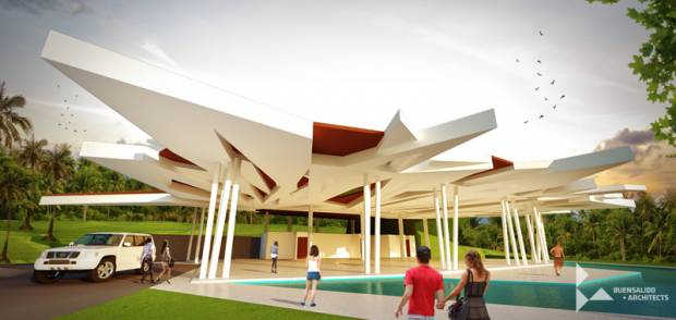
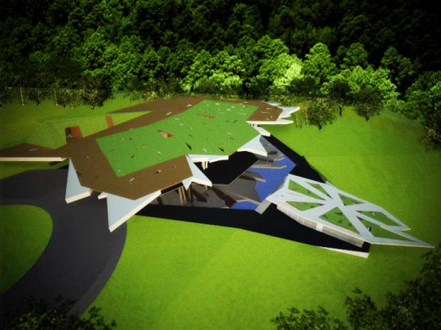
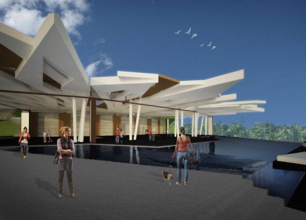
We were commissioned to design its newest event venue that would hold about 300 – 350 people and would revolve around a swimming pool to create a water-themed structure.

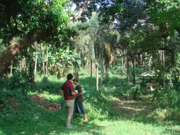
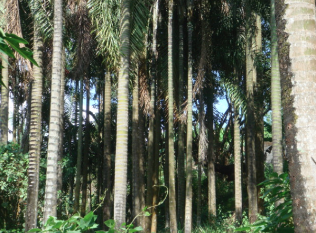
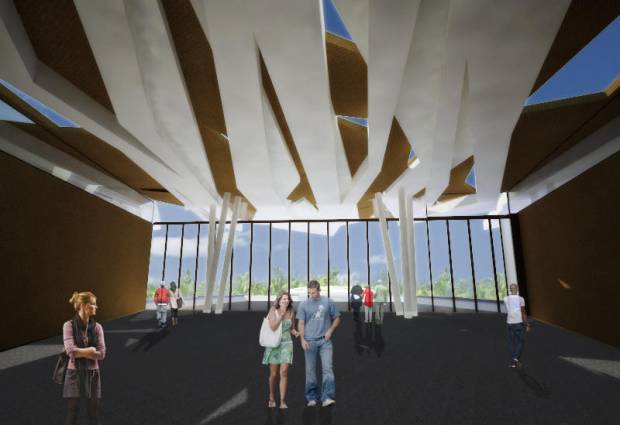
The first time we visited the site, we were struck by  two main things: the vertical rhythm that the coconut trees on site made, and the ever-changing pattern of shadows that their foliage created. We used these cues from nature to give shape to our structure. Dubbed as an “eco-tectonic imprint”, our proposed pavilion simply became an architectural translation of emergent patterns of nature that moved us as we absorbed the characteristics of the place.

perspective of ISLA PALMA

aerial view - showing pavillion, pool, and gazebo

view from poolside

view of interiors

San Vicente

March 31, 2012

As seen in Urban Monologues, Business Mirror Newspaper, Text by Jason Buensalido (July, 2007)


Just when I thought that developers, planners, and architects didn’t have a chance to correct the mistakes they made in developing Boracay, that’s the time an opportunity presented itself. I, together with another architect, was invited by a prospective client to accompany him to an ocular inspection of his property in San Vicente, Palawan, which he was thinking of developing into an exclusive beach resort. I have been to Palawan before, but I have never been to the San Vicente area, which is why I packed my bags right away and agreed to go with him without any hesitation.

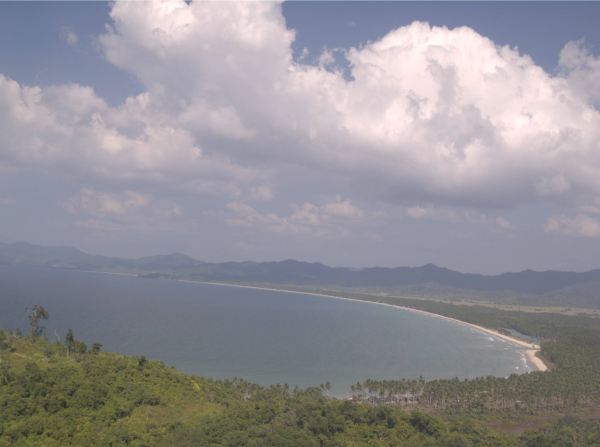
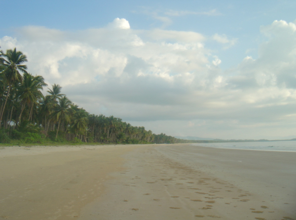
San Vicente is one of the many municipalities in Palawan and is located on its north-western side. It is bounded on the west by South China Sea, the municipalities of Taytay, Roxas, and Puerto Princesa on the north, east, and southwest; respectively. About 75% of it is generally forested, which allows the place to have a rich marine, agriculture, and forest resources endemic only to Palawan. It also has a pearl farm of about 8 hectares. But what impressed me most was the endless stretch of pristine and untouched white beach! Boracay is 7 kilometers long but only has a white beach that is about 2.5 kilometers. Imagine the beach in Boracay, multiply it sixteen times, and you’ll get an idea of how long the beach is in San Vicente because it runs a stretch of over 40 kilometers collectively! Now that’s what you can call a slice of paradise! During low tide, the beach can be as wide as 60 meters from the first line of coconut trees to the tip of the water. I could start to imagine the different recreational activities that you can do with a beach as wide as that. We visited the different parts of the long beach such as Alimanguhan, Maymanoc, Lion’s Head, Canefo, Luambong, Port Barton, and Exotic Island to name a few. From anywhere in the long beach, we enjoyed beautiful views of the open ocean, Mt Capwas, and the sunset.


San Vicente has a long beach of over 40 kilometers long

60 meter-wide beach

Being in an untouched and undeveloped municipality was very interesting. I was able to witness a number of ‘vignettes’ or ‘snapshots’ that describe the simplicity of the place. In the mornings and afternoons, all the kids of the town would walk kilometres to get to and from school. It would take them so long to get home that some of them would do their homework while walking, so that by the time they get home, they would be finished with their assignments. I also saw how some of them catch fish. The process is called ‘pangangawil’, where they use about a three hundred meter fishnet. One end of the net is left on shore, while the other end is pulled by a boat out into the open sea. The net is then brought back to the shore, forming an arch in the ocean. The two ends are then pulled by the whole community, little by little, until the entire fish net is brought back to shore. Some days, they fill up three baskets with different fish; some days, they don’t catch anything. The owner of the fishnet then divides the catch of the day into two. The first half is sold to local markets or is exported to other towns while the other half is given to the community as their food for lunch or dinner, making everybody happy.  I was deeply moved by how their community works together daily to achieve even a small task of catching fish. Even if they have simple lives, I didn’t see a face that didn’t have a smile on it.

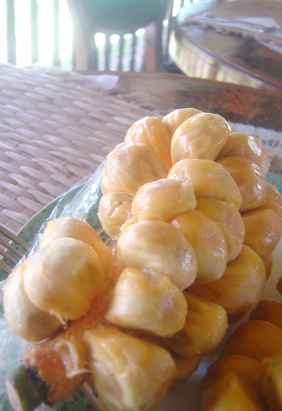
Another thing that made my visit to San Vicente paradise-like was the food. We stayed in ‘Caparii’, which was originally a scuba camp that was converted into a small resort complete with a dining hall, VIP suites, and function rooms. Throughout our stay, we would constantly joke around and call it the ‘fattening farm’, because it seemed like there was something in the food that made you want to eat more with every bite. Some of the food served was a soup that was a cross between lobster chowder, stuffed crab, chicken curry, and lapu-lapu. There were some vegetables that were endemic to Palawan. For dessert, they would serve this fruit called ‘champada’, a cross between marang and langka, whose seed they brought from Indonesia.

Developers and private investors are starting to see the development potential of this area. I am sure that San Vicente will be a ‘beach resort town’, ushering in a huge influx of local and foreign tourists. My only hope is that the investors, architects, and planners who will be coming in to prepare their respective designs will take into consideration the mistakes made in the famous Boracay. Environmental issues have to come first to ensure that this jewel of a beach will not deteriorate over the coming years. Proper setbacks from the beach front should be maintained and the architecture should be carefully designed so as not to seem too ‘imposing’ on the natural beauty of the place. For sure, there will be huge requirements for different resorts to be able to thrive in a beach strip as long as this. This is why alternate sources of energy should also be integrated in the preparation of plans. An updated development plan should be prepared to serve as a non-negotiable guideline for future developers. The local government and our tourism groups should form partnerships to enforce such plans and to ensure correct developmental procedures. I do hope that this time, nobody repeats the same mistakes.

A unique fruit called ‘champada’

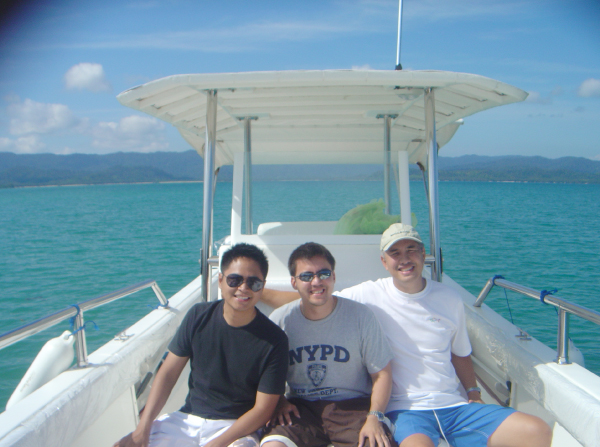
Island hopping with Arch. Gelo Mañosa and Chet Pastrana


The Urban Zone Story

March 31, 2012

Urban Zone was an iconic show on TV which featured well-designed homes and other spaces as well as the architects and owners responsible for their beauty. Hosted by Daphne Osena-Paez, it became a much sough-after and inspiring show for “Urbanistas”, and a platform where architects and designers like us could share our projects and design sensibilities. The show stopped airing on TV a few weeks back, and Buensalido+Architects’ Icon(‘s) Penthouse luckily caught the tail end of the show. It was truly an end of an era.

But as they always say – “When God closes a door, he opens a bigger one”. True enough, just yesterday, Daphne posted a video on her blog announcing that UZ will air in a new form. Its coming back with a bang thru her website - http://daphne.ph/ as webisodes!

We’re all excited for this as now, we can watch the show anytime, on our own schedule. We think that this is really a great move as it will now have a wider reach – time-wise, geographically, and socially. A true democratization of design. Kudos to you, Daphne!

Sharing with you guys her video, as seen in Daphne.ph. Enjoy!


Icon Penthouse on Urban Zone

March 8, 2012

view of the deck from dining

Sharing with you guys a link we found in the web of a video of our feature in Urban Zone in 2011. Our project ICON PENTHOUSE, was shown in the show, hosted by Daphne Osena-Paez. Thanks Daphne for featuring us and for helping us let people know that Filipino design can be contemporary too!

Here’s a link for more images of the project, as seen in our facebook page. – LINK

And here’s a link of that same feature in Daphne’s blog – Daphne.ph

Enjoy!


A Symphony of Steel and Stone : The Getty Center

March 4, 2012

(As seen in Urban Monologues, Business Mirror Newspaper, 2008) Text and Photos by Jason Buensalido

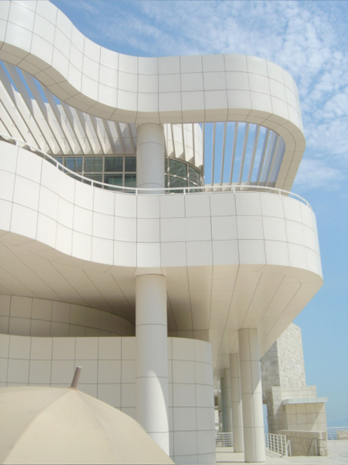
It is hard to miss the Getty Center in Los Angeles, California. I remember when I was driving along the San Diego hi-way to see it for the first time – the moment I saw a cluster of stark, white buildings on top of a hill, I knew that was it. Even though its dominant color is not close to any earth tone, the complex still appears as I it grew out of the site. The buildings are organized and massed in such a way that they almost follow the natural contours of the hillside that it is perched on. From a centralized parking area, I was taken to the top of the hill by a computer-operated tram. At the central arrival plaza, the whole symphony of Meier’s travertine and aluminum buildings could be better appreciated while enjoying breath-taking panoramic views of the city.

The Getty Center is comprised of the Getty Conservation Institute, the Getty Education Institute for the Arts, the Getty Grant Program, the Getty Information Institute, the J. Paul Getty Trust, the Getty Research Institute for the History of Art and the Humanities, the J. Paul Getty Museum, an auditorium, central garden, and several cafes and restaurants. All these buildings are organized along a natural ridge on the hilltop and around a series of courtyards and terraces. The vicinity is surrounded by high-end subdivisions with powerful people living in them. They requested that all the structures in the complex be no more than two stories high so the buildings won’t appear as if they were towering over their residences. The need for space was answered by extending the buildings underground and linking them with subterranean corridors that facilitate the moving of artwork and other materials.

The buildings are organized by a perfectly oriented north-south grid with a 3ft by 3 ft module, which clearly expresses the cubist beliefs of Meier. The museum is divided into five galleries or buildings, called pavilions, are North, East, South, West and the Changing Exhibit pavilion. These pavilions are clustered around a central courtyard. Though these five galleries are all connected by glass-covered bridges which make the transition from gallery to gallery easier, the visitor still has the option of coming out into the courtyard to skip a gallery and move on to his preferred one. The visitor therefore has freedom to move about the galleries in whatever sequence he wishes, unlike most museums, where people are required to take the prescribed flow.


The characters and shapes of the different buildings of the Getty Center.

The artwork is displayed throughout the pavilions chronologically: the North houses the oldest art while the West houses the newest. The first floor galleries house light-sensitive art, such as illuminated manuscripts, furniture or photography. Computer-controlled skylights on the second floor galleries allow paintings to be displayed in natural light.

To the west of the Central Garden is the Getty Research Institute (GRI). This circular building is used primarily by Getty scholars, staff, and visiting researchers. The library evokes the introspective nature of scholarly research, with book stacks and reading areas wrapping around a central courtyard. A ramp creates concentric paths, promoting interaction among the scholars and staff. A skylight pulls light through to the subterranean reading room. At the plaza level, a small exhibition gallery displays objects in the GRI’s collection for visitors.

To the north and east of the Arrival Plaza are the Getty Grant Program, the Getty Conservation Institute, and the J. Paul Getty Trust administration offices. Intimate sunken gardens, terraces, glass walls, and open floor plans provide fluid movement between indoor and outdoor space, and views of Los Angeles for Getty staff.

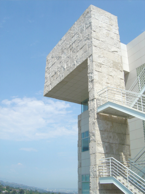
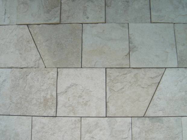
One of the most remarkable elements of the complex is the travertine stone that was used to clad most of the buildings. 16,000 tons of stone were quarried from Tivoli, Italy, 15 miles east of Rome. They claim that this is the same kind of stone the Romans used to build the Coliseum. To make the complex different, Meier and his staff worked for a year with the quarries to invent a process using guillotine to produce a unique finish.

TRAVERTINE STONE CLADDING - 16,000 tons of stone were quarried from Tivoli, Italy, 15 miles east of Rome. They claim that this is the same kind of stone the Romans used to build the Coliseum. To make the complex different, Meier and his staff worked for a year with the quarries to invent a process using guillotine to produce a unique finish.

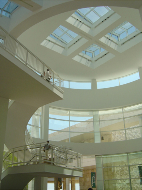
Meier has also been known for his expert use of natural light. The many exterior walls of glass allow sunshine to illuminate the interiors. A computer-assisted system of louvers and shades adjusts the light indoors. The galleries of paintings on the Museum’s upper level are all naturally lit, with special filters to prevent damage to the artworks.

USE OF NATURAL LIGHT - exterior walls of glass allow sunshine to illuminate the interiors. A computer-assisted system of louvers and shades adjusts the light indoors.

To me, The Getty is certainly one of the best designed museums in the world with its interior ambience that is perfect for appreciation of art, its lay-out which allows an efficient flow of visitors, and the placement of buildings which creates exterior public spaces that blend seamlessly with the landscape.

You may e-mail the author at design@buensalidoarchitects.com and visit his website at www.buensalidoarchitects.com