Posts tagged "contemporary"

Use of Indigenous Filipino Materials and Methods in Building Green Homes

October 16, 2015

(We recently did a collaboration with Lamudi.com, and we’re sharing with you what they had to say on Filipino building materials and sustainable designs, feel free to share your thoughts with us too!) 

Upon close inspection of local real estate, it can be observed that current housing trends follow the exemplars of American and European designs. However, many of these, though impressive, are not always ideal for our tropical climate.

Many lead to significant energy and operation costs, and the continued increase in building materials’ prices already pose a challenge during building. Despite modern developments providing more affordable solutions, not all are necessarily sustainable.

Remarkably, the greenest methods and materials may not actually come from foreign influence or future advancements, but from local ingenuity, history, and natural resources. Leading real estate website Lamudi enumerates just some of these indigenous materials homebuilders can use.

Bahay Kubo

The Sawali Design Cue

Favored in a tropical country, the bahay kubo had always been designed to deal with heat, humidity, and floods. Bahay kubos are built lifted from the ground or on stilts, allowing air to circulate from the under the house, helping keep it cool, as well as avoid significant flood levels.

While the indigenous concept, commonly referred to as the sawali, seems simple, it remains effective today, with existing bahay kubos naturally cooler than modern condos and houses. With the property type, space, and landscape permitting, the sawali can easily apply to contemporary homes.
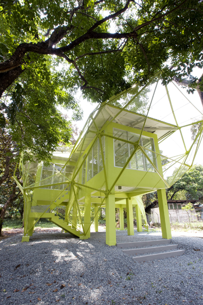
Contemporizing the Bahay Kubo is a challenge that gets us going. We tried to extract the principles of a Bahay Kubo and applied it in a more modern context

Bamboo

Bamboo comprises 80–90 percent of a bahay kubo. The material is very versatile, used as strips, split, or whole timber varieties. Unfairly given the moniker of “poor man’s lumber” and relegated for use in furniture, bags, and wall décor, bamboo has experienced a renaissance as a building material thanks to increased public interest in going green.

Technology has allowed bamboo to be cured, where it is soaked in special solutions that eliminate the starches that make it susceptible to fire and termite infestation. It also preserves the material, allowing it to last for as long as 30 years.

 Rice Hull Ash Cement (RHAC)

Of course, it is no longer practical to build a full-on bamboo bahay kubo, particularly in the metro, due to the risk to fire safety and durability. Concrete is essential for modern homes, and given that the standard variety has ingredients of volcanic origin, it can be costly, particularly in copious amounts.

Fortunately, the ash from rice hulls or husks is an affordable and effective substitute. When burned between 700 to 750 degrees Celsius, the ash from palay coverings offer binding properties that make it a suitable additive to cement solutions. Since rice is a common crop in the country, RHAC building materials are easy to sustain.

Coconut Lumber

While palm trees have grown in the different parts of the Philippines since the early portion of the 20th century, these were primarily just for the harvesting of coconuts. When trees stopped bearing fruit, it was commonly just felled to give way for the plantation of new trees.

With the increase in prices of more commonly used lumber variants, recent years have seen the exploration of palm trees as an alternative source. The once low valued senile coconut palm trees have since been promoted as a source of income for the lumber industry, with the material a source of veneer and numerous building products.

We wanted to introduce the Spirit of Optimism and Community with these houses that will hopefully be built in Tacloban

Santol Wood

Quite common in the Philippines, santol is mostly known for its fruit that is popularly consumed and used as an ingredient in places all over the country. What most don’t realize is that the tree that the fruit grows from is also an ideal wood alternative.

While the material is comparatively less dense than other wood variants, it is one that is easy to work with and polish. This, of course, is if the lumber was cured correctly. Probably the best feature of high quality wood from santol trees is that it is highly resistant to wood borers, or bukbok. This makes it ideal for use as protective covering or skeletal framework.

Infographic courtesy of the Lamudi team

For more information on Lamudi, visit their website at http://www.lamudi.com.ph

Buensalido Architects launches Random Responses, sparks movement for Filipino architecture

March 29, 2015

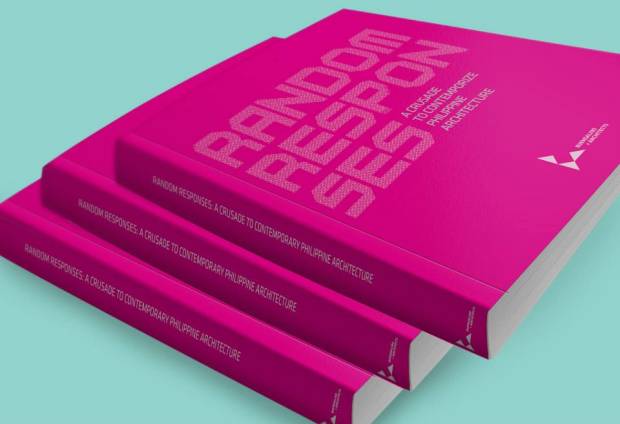
Buensalido Architects may only be on its eighth year, but the architectural, interior, and urban design laboratory has already built a formidable resume of projects that show off its distinct design flair, and the launch of its book Random Responses only added to the firm’s string of contributions to the industry as it aims to contemporize Filipino architecture.

Held October 28, 2014 as a cocktail event at the Main Lobby of the Cultural Center of the Philippines (CCP), the launch of Random Responses solidified Buensalido Architects’ mission to instigate change in the country’s design industry.

Hosted by Issa Litton, the affair brought together Buensalido Architects’ industry friends and distinguished clients. Principal Architect and Chief Design Ambassador Jason Buensalido, wife and Associate Architect Nikki Boncan-Buensalido, and VP for Operations Ems Eliseo led the team as they welcomed some of the event’s guests, which included Ces Drilon, Julius and Tintin Babao, Ed and Dinti Tuviera, Atty. Charito Planas, Artist Leeroy New, Joseph and Stenie Tay, and Daniel and Monica dela Cruz.

Also joining the firm in celebration were Architects Manny Illaña and Rommel De Guzman of Ayala Land, Ric Gindap of Design For Tomorrow Branding Consultancy, Mike Marquez of Evermount Construction, Tony Tuviera, Direk Mike Tuviera, and Jojo Oconer of APT Studios, and CCP’s Tess Rances and Nes Jardin, who received the book for CCP.

A compendium of the firm’s past, future, built, unbuilt, small, and large scale projects, Random Responses is Buensalido Architects’ “love letter” for Philippine architecture, which the firm believes still holds great relevance amidst the newer, more foreign architectural styles in vogue today.

Random Responses is our call to fellow Filipino architects, designers, and creatives to spark an architectural revolution, one that brings back the glory of Filipino architecture as exemplified by the bahay kubo and the bahay na bato,” said Principal Architect and Chief Design Ambassador Jason Buensalido. “We believe that by applying contemporary materials and methods, we can enliven Filipino architecture to make it appealing and competitive in the current times, despite the prevalence of newer and more foreign design styles.”

A special exhibit which included some of the works featured in the book, as well as a special book signing for guests by Architect Jason Buensalido capped of the event.

The Random Responses Book Launch and Exhibit was made possible in part by general contractors and Buensalido + Architects collaborators Evermount Construction Corporation and Perfect Dimension Corporation.

Random Responses: A Crusade to Contemporize Filipino Architecture is available for purchase through email: design@buensalidoarchitects.com. For further inquiries, please contact +632 478.3445. The book will be available in bookstores beginning second quarter of 2015.

Modernity: A Menace or A Promise?

March 29, 2015

Photos and Text by Nikki Boncan- Buensalido (As seen in Urban Monologues v2.0, Business Mirror)


What does it mean to be truly modern? How did modernity come about and how did it evolve in the past century?

My most recent adventure took me to “Fundamentals” the 2014 Architecture Biennale which is currently on display in Venice, Italy.  The exhibition, which runs from July 6 until November 23, 2014 is the 14th international architecture biennale exhibition entitled “Absorbing Modernity 1914-2014” portrays the century that has passed highlighting the influences that changed the parameters of modern architecture.  Some countries were ravaged by war, destroyed, divided, occupied leaving people traumatized yet these countries have survived and have come out stronger.  The exhibitions of the different pavilions from various participating countries show how the elements of architecture have survived and how they evolved to put up with the latest ideas and inventions of their time.    These exhibitions aim to perform an “audit” of architecture and posts questions such as: “what do we have?”, “how did we get here”, and “where do we go from here”.  According to Paolo Baretta, president of the Biennale di Venezia exhibition, the presence of the national pavilions representing 66 countries, show national identity and the country’s ability to become a protagonist in the cosmopolitan world of art and architecture.

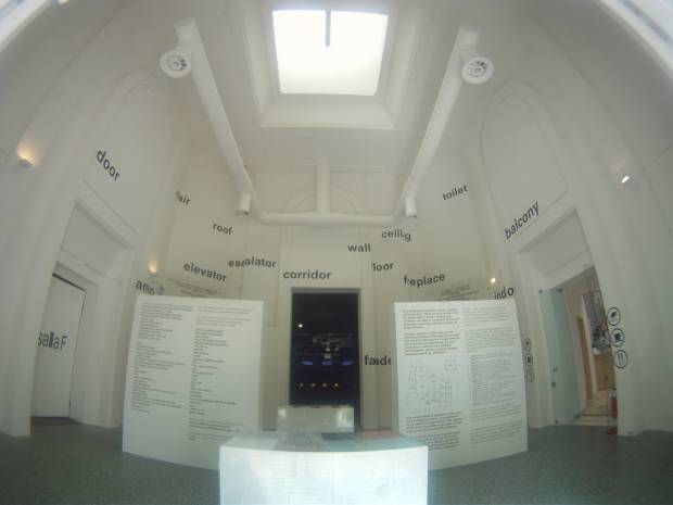
The “Elements of Architecture” exhibit curated by well-known Architect Rem Koolhaas offers a new perspective on the elements of architecture that should form the relationship between us- our civilization and architecture. The exhibition compiles a new body of knowledge that explores the often universally mundane parts of a building and highlights its evolution.  The floor, the ceiling, the wall, the roof, toilet, windows etc. are exhibited and broken down into parts and how it was developed over the past century.  With great courage and ambition, Koolhaas mentions that he was able to review the history of modernity in the past hundred years, and offers a new perspective of those “elements” that should constitute reference points for the new architectural prototypes of the next century.  Afterall, these elements, being the simplest parts of a structure will essentially never be removed no matter how the next century architectural models evolve.

As one lands in Venice, the biennale is celebrated everywhere.  The exhibit spaces are divided into three venues and showcase not just architecture but art, dance, film, theater and a music festival as well.  The summer sun complemented the exhibit space at the Giardini Gardens as well as the Corderie dell’ Arsenale grounds where the architecture pavilions were located.  What was effective for this Biennale was that it was truly about architecture and not a tribute to the architects themselves generally making the exhibit communicate in a more universal language.  It highlighted in-depth research, discourse and discussion on modernization of architecture rather than a simple portrayal of various architects’ works which made the experience even more insightful.

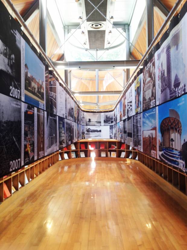
Upon disembarkation from the Vaporetto, the taxi boat that takes you anywhere in Venice, we were greeted by a pylon welcoming us to the biennale and signs that led us through the grounds.  Our first pavilion was the Stirling Pavilion which houses an exhibit of the past century’s effect on various countries thereby ‘Absorbing Modernity’.  The pavilions post the question of national identity being sacrificed to modernity as the development of global architectural movements and technological processes took over the once local and vernacular architecture.  It turns out that each country has adapted and evolved from their individual experiences, be it war, new technologies available or natural destruction, etc. to create their own definition of modernity.  Images compiled from various pavilions show how each country has locally adapted to the miles stones of modernity.

Milestones of Moernity – The Stirling Pavilion houses the exhibit that shows images compiled from different countries on how the concept of modernity has affected their design thinking and their built environment

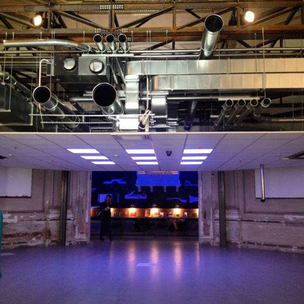
Rem Koolhaas Exhibition on his “Elements of Architecture” was also top pick on my list of exhibits.  Upon entry of the main gallery, one is greeted by a 1:1 installation of the ceiling.  The exhibit talks about how the modern ceiling has become a faux representation, whose main purpose is to conceal utilities within it, increasing in space requirements over time, effectively decreasing the served spaces below.  It was interesting to see how the utilities were initially placed on the floor early on in the century and how it has technology has allowed us to transform the way buildings and ceilings are constructed.

Rem Koolhaas' Ceiling – Rem Koolhaas shows how the modern ceiling has become a faux representation, whose main purpose is to conceal utilities within it, increasing in space requirements over time, effectively decreasing the served spaces below.

Fundamentals - The exhibition compiles a new body of knowledge that explores the often universally mundane parts of a building and highlights its evolution. The floor, the ceiling, the wall, the roof, toilet, windows, stairs, elevators, etc. are exhibited and broken down into parts and how it was developed over the past century.

Various wall cladding installations were also displayed and Koolhaas was able to show how temperature and climate change affected building systems and how they work.  It made me think of how designers are constantly looking for solutions to improve living qualities and building techniques and how sustainable materials are incorporated more often at this time.  This just goes to show that designers are now more sensitive to climate change and how information has been widely available to the vast majority.  Experimentation and new inventions help push modernity forward keeping building technologies at par with the fast evolving times because of globalization and the internet age.

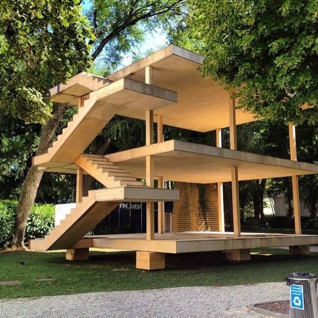
 Aside from the Central Pavilion where the “Elements of Architecture” were tackled, was caught my attention was the installation of the Architectural Association (AA) Students.  They replicated a 1:1 scaled model of Le Corbusier’s ‘Maison Dom-Ino’ which dates back to 1914. The structure was first designed as a prototype for mass-produced European housing whose design as been iconic images of 20th Century Architecture. “This initial installation will remind visitors not only of modern architecture’s most foundational project, but of an architectural instinct made even more apparent today than it was at the time of its original conception; namely that architecture always operates in the space created by a contrast between architecture as already known, and what it might yet become,” said Brett Steele, AA School Director.

Le Corbusier's Dom-Ino - A 1:1 scaled model of Le Corbusier’s ‘Maison Dom-Ino’ which dates back to 1914. The structure was first designed as a prototype for mass-produced European housing whose design as been iconic images of 20th Century Architecture

The French Pavilion caught my attention because it was challenging the evolution of Modernity as a menace or a promise of a better built environment.  The French have contributed a lot to modernity in terms of architecture and engineering.  The research inside the pavilion questioned if the large scale monotonous housing structures of heavy pre-fabricated concrete panels answered the questions of economic scale or monotony in design and which of these should be taken into consideration more: Design or Utilitarian Function? On the other hand, they also showed how structures like this which were put up in 1942 are now undergoing the process of re-urbanization.

Overall, the Biennale led to me think about how modernization affects those living in this time and age.  A century ago, the concept of modernity was so different from what it is now.  An introspection of the past points out that modernity always had the intention of trying to innovate and trying to improve the way of life through technology and new ideas.  It has challenged us to think of new ways on how to evolve as each generation is an improvement of the former.

In some ways, modernization has also affected our social relationships and how we interact with one another.  Personal touches disappear as one is all too dependent on man made machines. Cultural identities in architecture are less pushed to give way to a standard way of doing things such as pre-fabrication to achieve efficiency. Family communications are now limited as social media through the internet has depreciated one’s ability to personally communicate with another. It could happen that a family lives under one roof, yet they don’t see each other for weeks physically, since they are connected to each other virtually anyway. At the same time, this same technology has allowed information dissemination and new to spread faster and more efficiently.  More people are aware of current state of affairs.

Modernity is positive except that we have to be extra sensitive to what it affects, especially our social and cultural values.  One just has to think of how to balance the menaces and the promised of this new and constantly evolving society.  So to answer the question on whether modernity is a menace or a promise. Well, I guess it can be both.

20 Young Outstanding Filipino Designers Under 40 – BluPrint Magazine

March 29, 2015

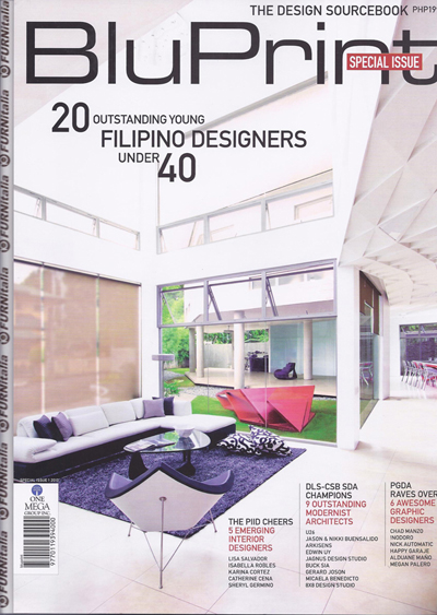
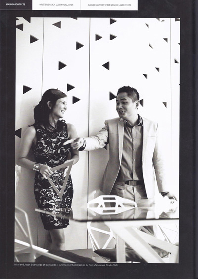
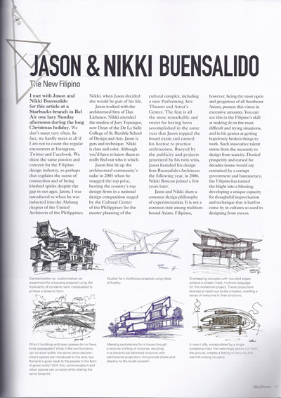
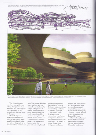
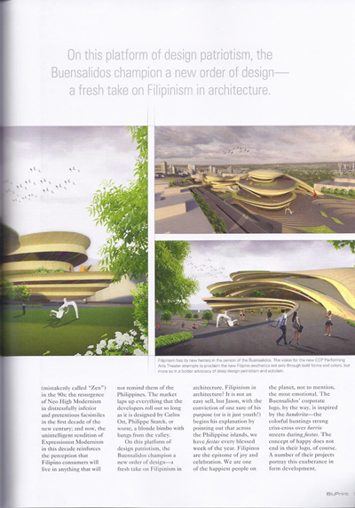
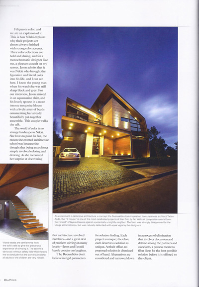
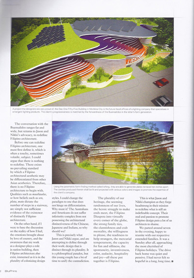
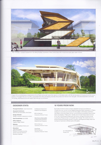
In 2013, we were privileged to be part of BluPrint Magazine’s list of 20 Young Outstanding Filipino Designers under 40. The article was beautifully written by Joseph Javier and clearly expressed our crusade to contemporize Filipino Architecture. Entitled THE NEW FILIPINO, we had a discussion about our beliefs and design practice, striving towards a NEW FILIPINISM in our architecture.

Thank you again, BluPrint!


S House in Urban Zone

May 10, 2014

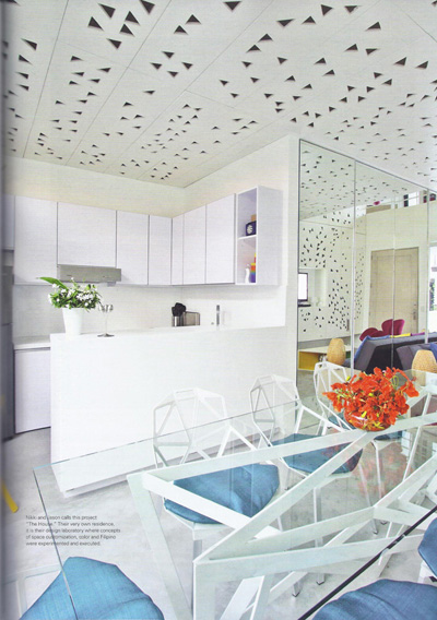
Sharing with you guys our latest completed residential project, S House, as featured in Daphne Osena-Paez’ webisode of Urban Zone. Thank you Daphne for providing a platform for us to share our ideas and spread our ideas on “Filipino Rennaisance”. Mabuhay!


Designing houses in the Philippines can be frustrating a lot of times for us. Since we practice contextual architecture, we do not believe in ‘themed’ residenial developments but instead believe in an architecture that is designed specifically for the place its going to be built, the climate there, and should reflect the culture and identity of the people using it. For this project, for instance, the lot is located within a strictly Mediterranean-themed development. We understand the whole point of having rules and restrictions in a subdivision which is essentially to achieve harmony within it. But since the village had a mediterranean theme, and houses there had little or no eaves, we were being restricted to have a maximum of half a meter for our eaves! This doesn’t make sense at all in a tropical climate because we need eaves and canopies and different architectural contraptions to be as long as they can be to protect our fenestrations from heat and rain (which happens to hit the house horizontally when combined with strong winds).

We essentially designed the house as if we weren’t governed by the theme. We designed it to be honest to it’s site, climate, condition, and client’s pramaters. We started off with the idea that as an owner or designer of a private house, we will never have control over the urban condition that surrounds our property. One day, it may look good, the next day, it may deteriorate because of lack of maintenance. The theme of the village, for example is something we cannot control, more so the attempt of the other homeowners to build a Mediterranean house but most often ending up wth a very poor and tacky copy.

Given this fact, we proposed a house that’s defensive. A house that’s inward looking, and whose back is faced towards the street, and whose spaces all are oriented towards it’s own controlled environment, in this case a courtyard in the heart of the house. By doing this, the spaces between the street and the courtyard become transitory barriers that protect the controlled environment within from being degraded by the uncontrollable harshness that our urban jungle creates such as noise from traffic, pollution, undesireable views, etc.  We used public spaces such as circulation areas as visual and auditory buffers that protect the private spaces from the outside world.

We proposed a house with projecting canopies to ensure the interiors from direct heat gain. We realized that if we push back the building line a bit back relative to the allowable building line, we can have longer eaves and canopies. In combination with this, we made sure that cross ventilation occurs throughout the house. The plans of the house are not deep, therefore making it easy for wind to exit through another opening as soon as it enters.  Even walls that open up to an internal hallway have transom windows, to allow wind to cut through. There is no room in the house whose windows are only on one wall effectibely funneling the wind to cut across the entire length of all rooms.

We proposed a house whose general form is still oriented towards the courtyard, articulated with a series of walls that act as if they were hugging and shielding the internal environment of the house from the outside world, made even more expressive by arraying these fins in shifting angles.

We proposed a house that is honest with its materiality – concrete is shown as concrete – raw and unpainted. Wood is shown with all of its grains and knots. Glass is kept as transparent as it can be. The imperfections of all of these materials remain unhidden.

We took a chance on the design as we believed that it represented the client’s preferences, and the cleint ended up believing in the design so much as well. We submitted the plans to the subdivision with our fingers crossed. Despite the theme,  and with a little push and a bit of argument, we had the design approved. Ever since it was built, the village has now been revising their regulations. The mediteranean theme has slowly been eased out as they realized that it was only a market-driven trend and there are now lesser and lesser people wanting to buld their house in such theme, especially after seeing that an honest house can turn out to be much more beautiful and expressive of who they are than themes that developers set. To cause things to change for the better, some rules should really be aimed to be broken.

Aktiv Sports – Eastwood

October 20, 2012

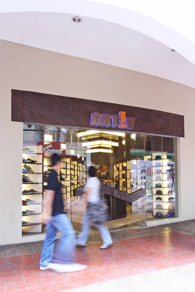
storefront

"all great artists sign their work" - steve jobs

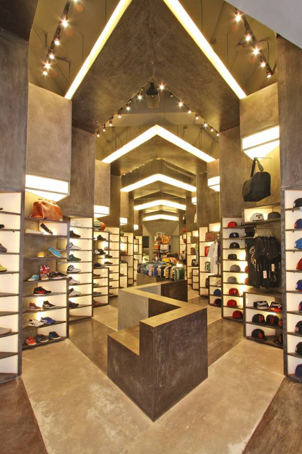
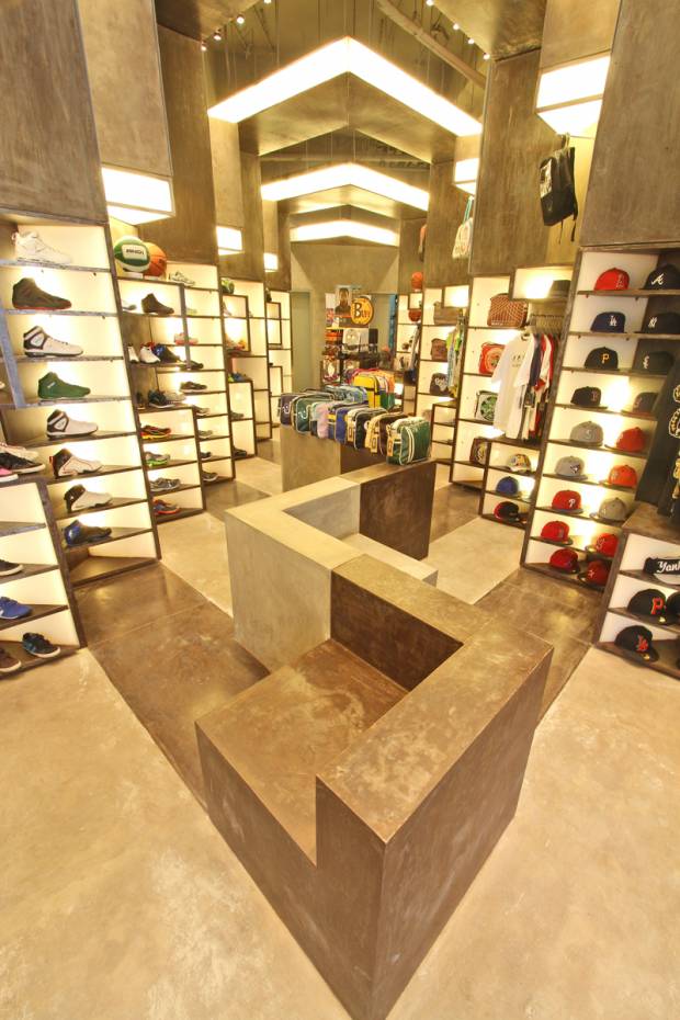
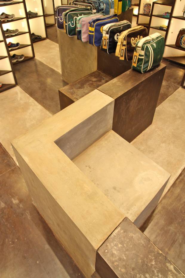
A few months ago, we were comissioned by the Relzbach Group to do a re-vamp of their store. Aptly called AKTIV, its a brand they developed that carries multiple brands under their wing such as Gola, New Era, Hunter, and Buff, among others.

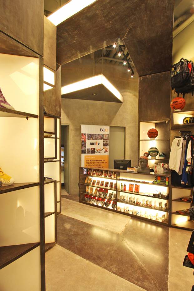
Given all of these multiple brands with identities of their own, the real challenge was how to make the store look harmonious with all of these brands that have their own identities. Our solution was simple – to develop a module that could function in multiple ways as well, so that it could adapt to the specific need of each product. We started with a display shelf whose dimension was based on a shoe – this box is stackable to display multiple shoes, or be adjusted in dimension, to display products with differnet sizes such as bags and shirts. These boxes were also used as light shelves, to illuminate products that are far from the source of light in stores which is usually the ceiling. The boxes could also be used as signage bands – and with this, a certain visual organization was achieved as even if their logos and signages looked different from each other, the similarity of the module size and configuration that houses these logos are the same.

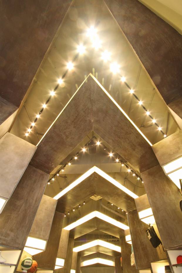
These modules were then rotated in such a way that it faces the storefront for premium visibility, stacked on each other, to form these “toblerone” shaped display modules (as the client fondly called it), that create an even bigger module collectively formed by the boxes. Sort of like an picture (toblerone) formed by pixels (boxes).

Being a store that focuses on an active lifestyle, we wanted to simulate the spirit of movement. By stamping these toblerone shaped modules throughout the perimeter of the store, a certain rhythm was achieved thru repetition, creating a visually appealing and dynamic atmosphere.

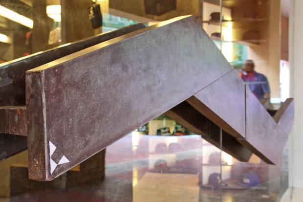
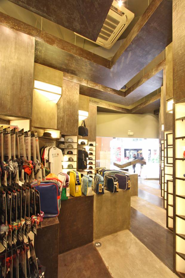
The choice of materials presented much difficulty during construction because of the absence of veneers. Concrete is seen as concrete. Metal is presented as metal. We wanted to achieve a certain kind of rawness in the interiors – the same kind of rawness people feel when they’re active. Call it visual honesty.

the space upon entry

the sales counter

view from the interiors, looking towards the storefront

bench / display

ceiling details - the shape is similar to the AKTIV identity


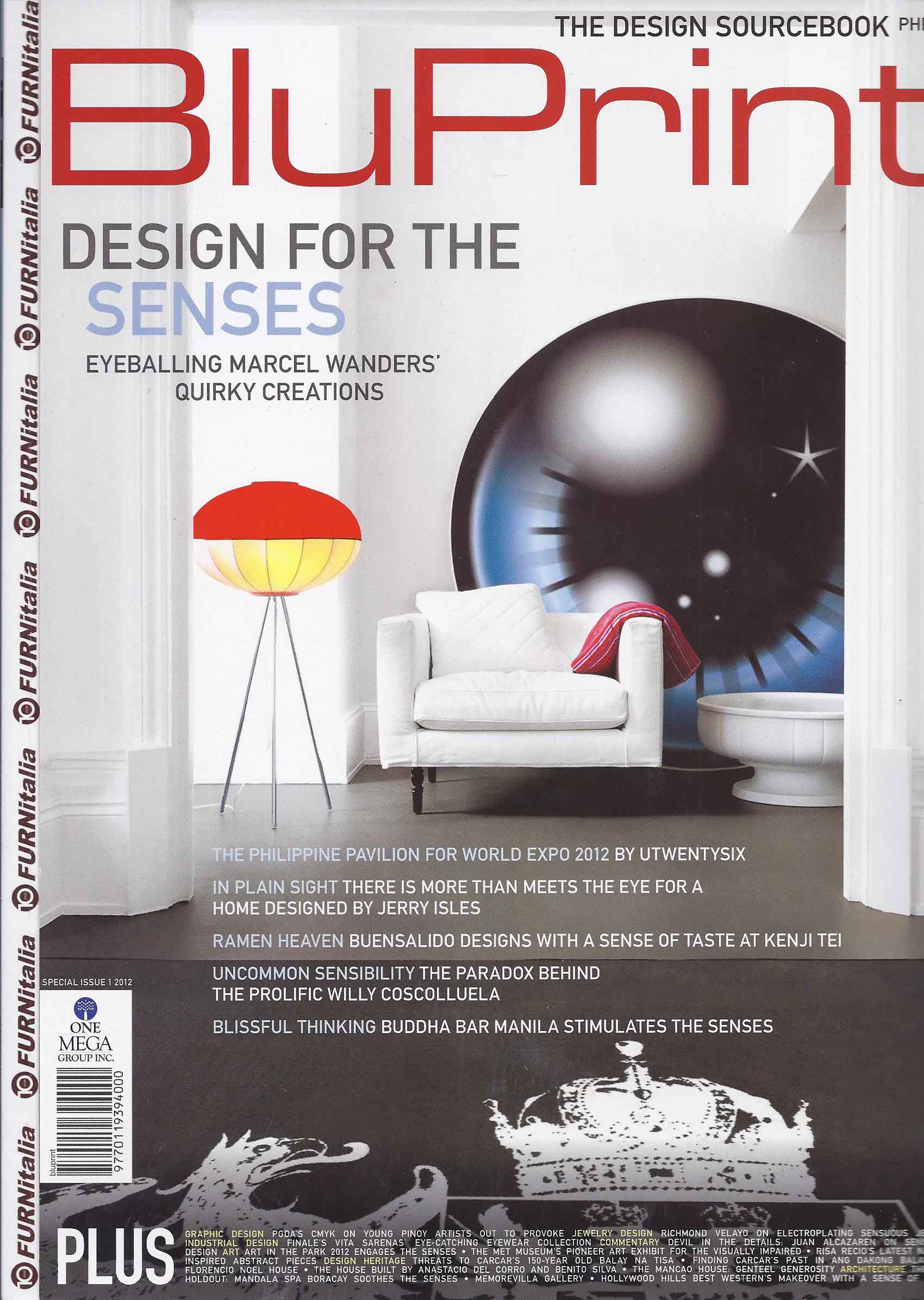
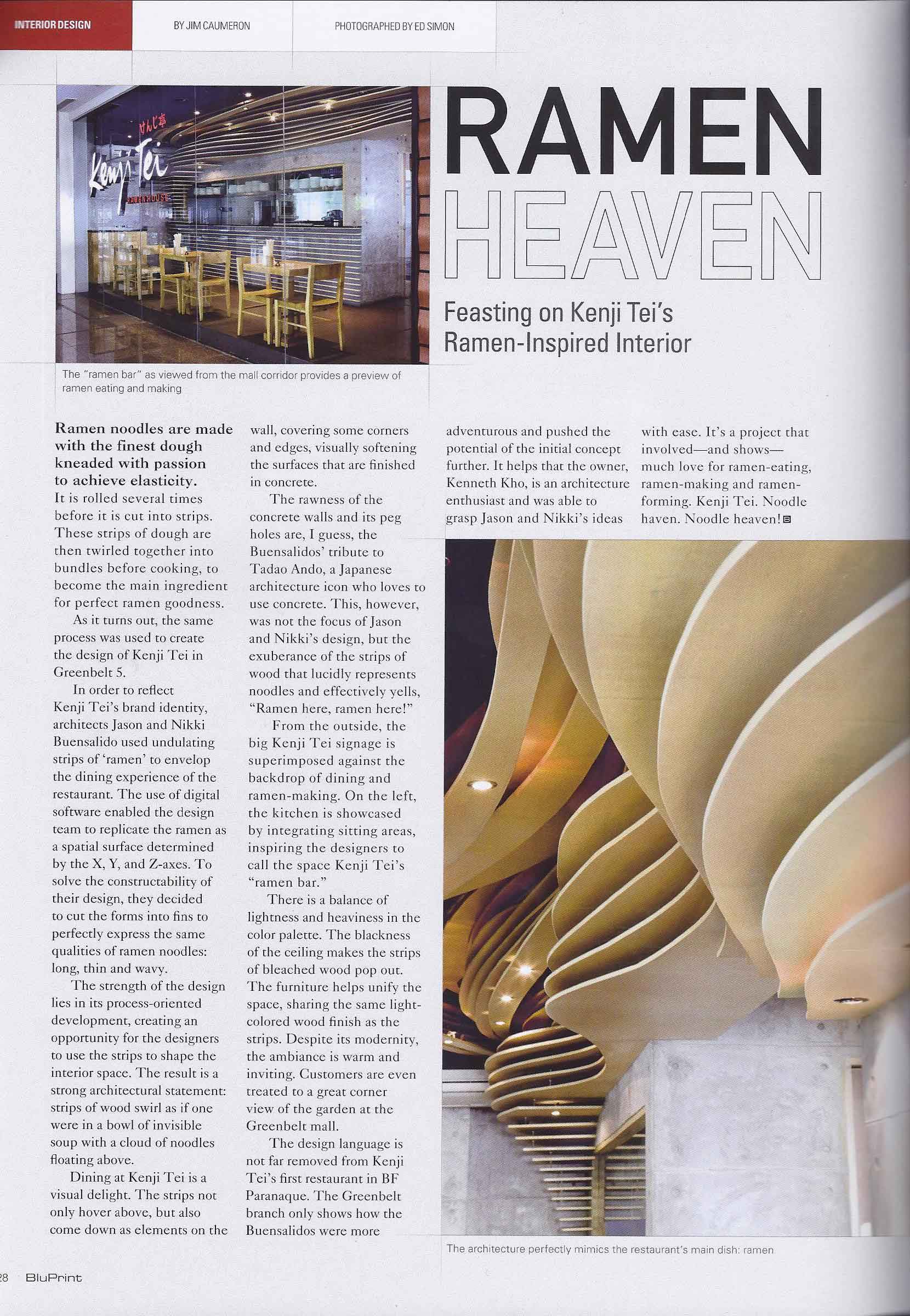
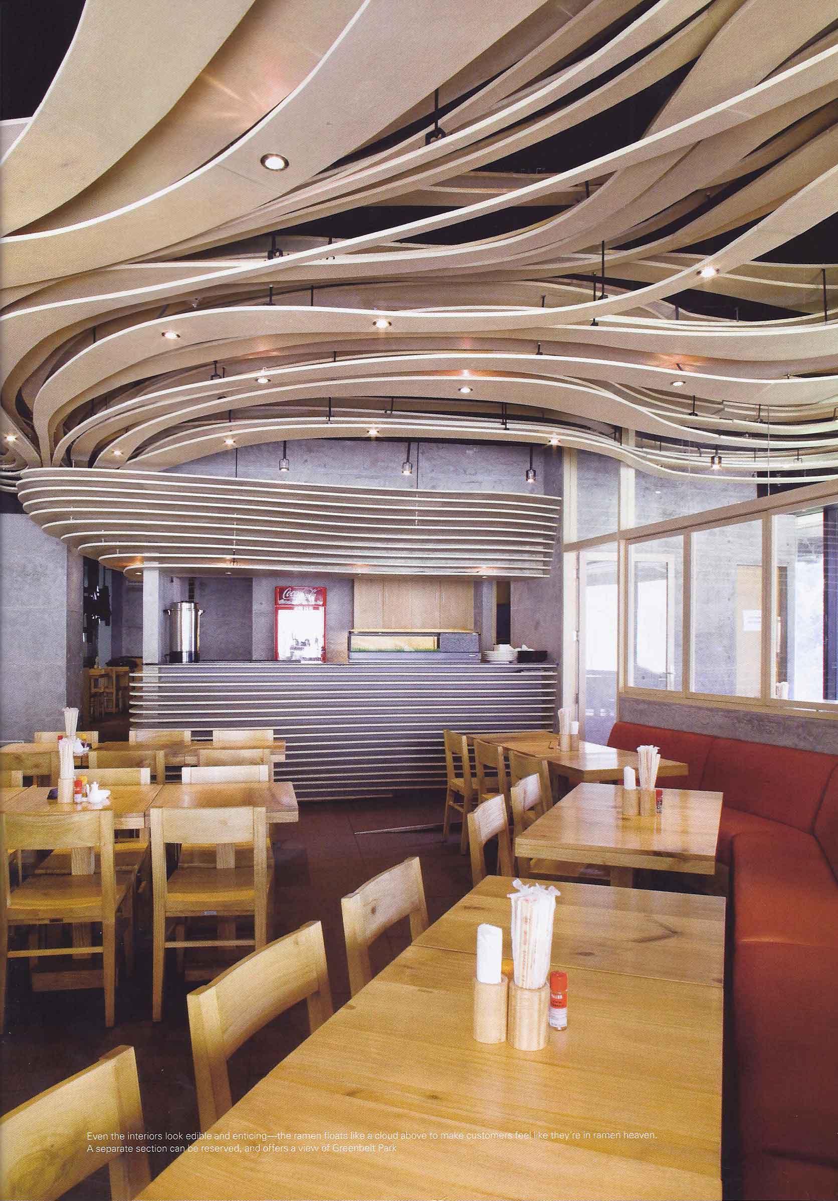
Kenji-Tei Greenbelt 5 at BluPrint May 2012

May 4, 2012

BluPrint Magazine, one of the firm’s favorite magazines, features Kenji-Tei Greenbelt 5 in their Interiors section. The shoot and interview were done simultaneously a few months ago with Asst. Editor Gaby Alegre, photographer Ed Simon (who took the spectacular twilight photo of our chapel project  in Batangas that made the cover of BluPrint as well), and Jim Caumeron. Ken Kho, our friend, maverick restaurateur and owner, was of course there as well.

We had to schedule it at 730 in the morning because everybody’s schedules wouldn’t meet and that was the only time everyone could be there at the same time. It actually worked well especially for the shoot because the reflections of the other store’s signages weren’t visible in our storefront shot, and the morning light penetrated the interiors beautifully.

Here’s how the feature looks like:

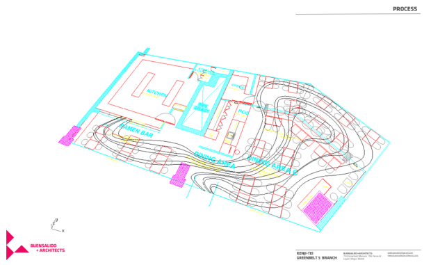
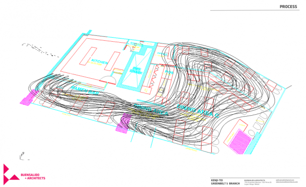
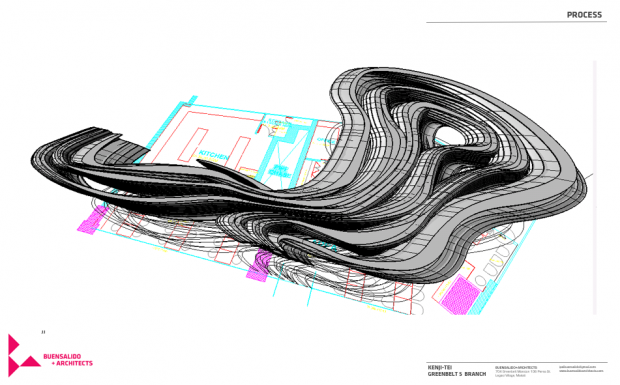
Some process diagrams and original renderings of the ramen house:

original renderings - showing dining space and function area

original rendering - dining area towards sushi bar

Thanks again BluPrint! Grab a copy now! Try the food too, especially their cheese gyoza, curry ramen, and the spicy negi ramen! Cheers!

Icon Penthouse on Urban Zone

March 8, 2012

view of the deck from dining

Sharing with you guys a link we found in the web of a video of our feature in Urban Zone in 2011. Our project ICON PENTHOUSE, was shown in the show, hosted by Daphne Osena-Paez. Thanks Daphne for featuring us and for helping us let people know that Filipino design can be contemporary too!

Here’s a link for more images of the project, as seen in our facebook page. – LINK

And here’s a link of that same feature in Daphne’s blog – Daphne.ph

Enjoy!