20 Young Outstanding Filipino Designers Under 40 – BluPrint Magazine

March 29, 2015

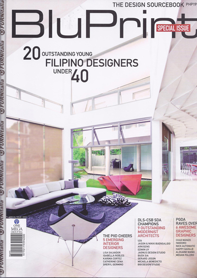
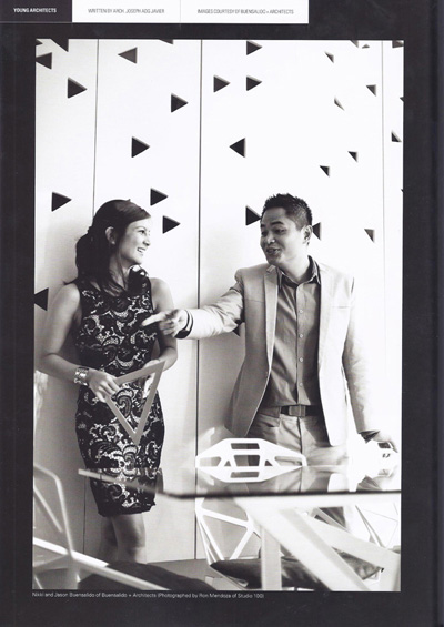
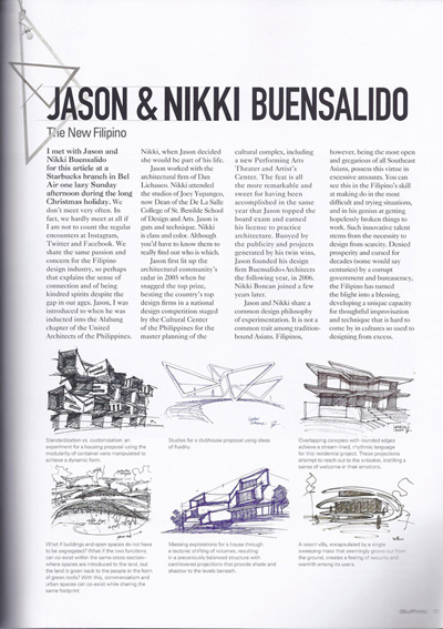
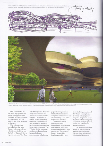
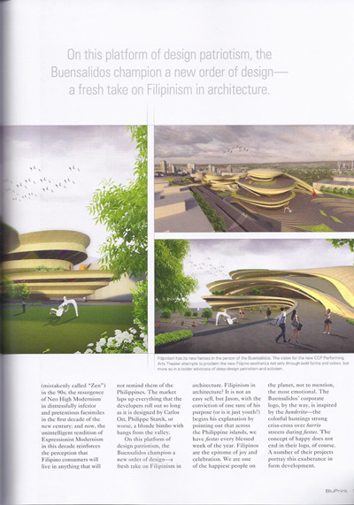
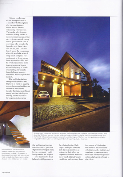
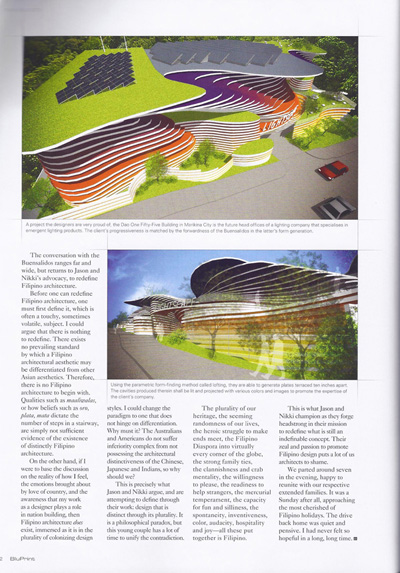
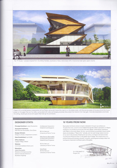
In 2013, we were privileged to be part of BluPrint Magazine’s list of 20 Young Outstanding Filipino Designers under 40. The article was beautifully written by Joseph Javier and clearly expressed our crusade to contemporize Filipino Architecture. Entitled THE NEW FILIPINO, we had a discussion about our beliefs and design practice, striving towards a NEW FILIPINISM in our architecture.

Thank you again, BluPrint!


Whenever, Whatever, Wherever. Just Ask. – W Hotel Taipei

November 15, 2014

By Nikki Boncan-Buensalido, As Seen in Urban Monologues 2.0,  Business Mirror

When W Hotel agreed to host our 3 night stay in Taipei, we were ecstatic.  As avant-garde and modern architects, we knew that the W Hotels Worldwide Chain was nothing short of impeccable attention to detail.

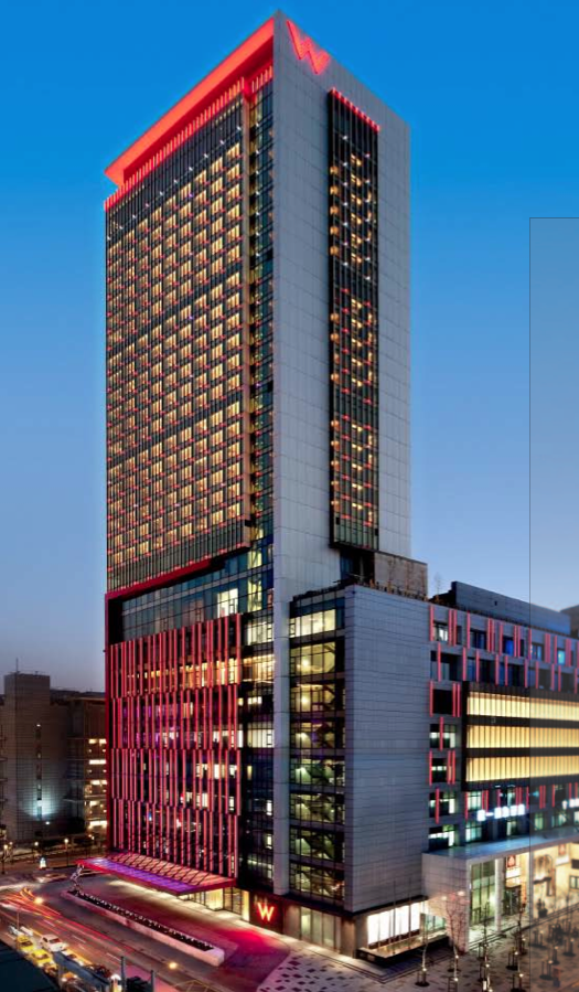
 W Hotels Worldwide is an industry innovator that brings a jolt of electrified design surge to Taipei.  W Taipei, located in the heart of the bustling Xinyi  Central Business District is an electrifying sanctuary of serenity and energy in the heart of this bustling neighborhood, reflecting the surrounding natural beauty of Cising Mountain and Yangmingshan National Park, juxtaposed alongside Taipei’s vibrant, modern cityscape. “Besides being the urban mecca and capital of Taiwan, Taipei’s strong connection to nature continues to influence the culture here. W Taipei will be a haven of fun luxury, where serenity meets energy and will be the venue of choice for discerning and style-conscious trendsetters who want to be wowed by the finer things in life – particularly those inspired by W brand’s unique mix of contemporary cool design, modern comfort, and innovative style” recounts Cary Gray, General Manager of W Taipei.

W Taipei’s vibrant exterior at dusk carries through the entire branding experience of W Hotels

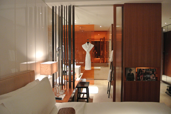
We arrived in the evening and were greeted by Wina Chen, Markerting and Communications Director of W Taipei and we were ushered into our ‘Wonderful Room’ one of W Taipei’s 405 guestrooms and suites.  As designers, the room itself was a feast our eyes.  We were greeted by the oh so soft and ultra-comfy 350 thread count linen W Signature Bed accompanied by state-of-the-art in-room technology, including high-speed wired and wireless Internet access; flat-screen, 42-inch LCD televisions; Surround Sound Bose sound systems; iPod charging docks; IP phone with voicemail; and a W Taipei signature zodiac animal that greeted us set the mood of our stay. Warm-colored stones, burnished wood and lush electrified floral carpeting contrasts with modern, subtle lighting inspired by Chinese lantern boxes bring out hints of the local Taiwanese culture while the white table and designer leather chair set amidst a seating vignette overlooking Taipei 101 acts a good complement to the background and view overlooking the lights of the city – which I though was a good balance of culture and modern design in one space and a true epitome of chic and style.

Sliding doors disappear when tucked inside pockets on the wall blurs the separation of the bedroom from the bathroom.  The bathroom on the other hand is accented with an oversized vacation-style islander tub set against an orange or chartreuse panel set beside the shower area and a seamlessly connected counter with an oversized lavatory complete with bath products all labeled the W way.

The architectural details were all there because they needed to be there.  The screws, the placement of the doors, lights were all there because they needed to be there. It was a very smart way of providing comfort.  From the sliding doors of the bathroom all the way to the termination joints of the drains, there was a very high level of design and detail.  Everything was well thought of.

The Hotel Room - Everything is there because it needs to be there.

The next morning, Gary Lee, Marketing and Communications Manager of W Taipei gladly showed us around and described in detail what the W Linggo was and how everything was tied to their concept.  Gary related that different W Hotels in various parts of the world had different themes.  W Taipei’s was “Nature Electrified”.  Gary related that this theme stemmed out of Taipei’s distinct location set amidst the Yangmingshan range of mountains and the Yangmingshan National Park.  W Taipei’s vision was to bring in nature and translate it in an electrifying hip and happening way.

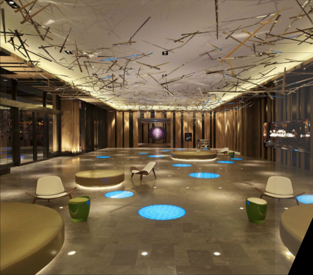
As one enters the W Taipei’s Wheels Lobby, one enters a sensory overload of layers and layers of design.  From its front door mat that greets visitors a Good Morning, Good Afternoon and Good Evening depending on the time of the day to the Whatever Desk where you can ask for “Whatever you want, Whenever you want” (As long as its legal). The Whatever, Whenever Service is one only W Hotels Worldwide has and they can give literally Whatever you what, Whenever you want it. (We tried asking for hairpins, a pancake recipe from the Kitchen Table, which was emailed to us directly by the Chef and a nail cutter) All you have to do is ask.

 Upon entering what distinctly caught our curiosity were two art installations called “To Light You Fade” created by Random International, UK.  The installation is an interactive piece that deconstructs a person’s movement as one passes by it. It is mounted on a reclaimed wooden wall on the ground floor of W Taipei and allows guests to engage with the light itself in an intuitive manner.  Developed with custom software, this installation consists of several hundred unique OLEDs (organic light emitting diodes) from the world’s first ever production line in Aachen, Germany.  Jason and I spent quite an amount of time watching it and playing with it and even posted some pictures and videos of it on Instagram.

The second installation was a Circular Disk titled “Purple Target” by the elevator Lobby. Created by Howard Chen of China also exclusively for the W brand.  What caught our fancy was that this piece was entirely made out of high-grade thumbtacks.  Later on, Gary recalls that W Taipei houses a big collection of design installations throughout the hotel that synergizes with the design of the spaces while charging one’s sensory experience.  Even the elevator itself that took us up to the 10th floor Welcome Desk was on detail overload mode!

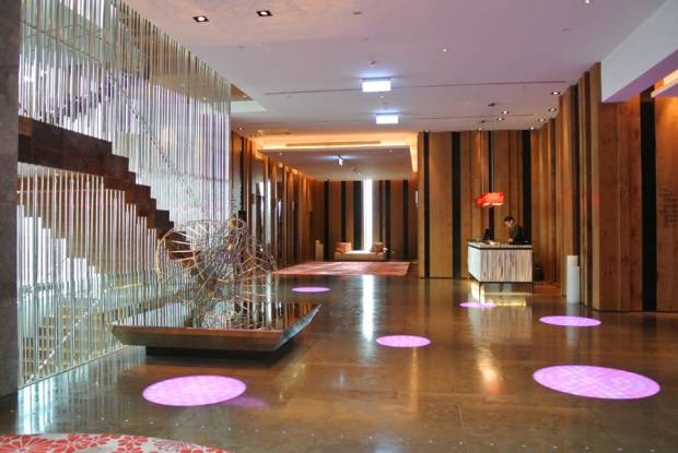
W Taipei’s “Nature Electrified Lobby” showcasing mixed elements of wood, bamboo and steel framing the motion censored LED Art Installation on the lobby wall. What distinctly caught our curiosity at the Wheel’s entrance were two art installations called “To Light You Fade” created by Random International, UK and a Circular Disk titled “Purple Target” by the elevator lobby created by Howard Chen of China also exclusively for the W brand

Gary showed us around the Welcome Desk juxtaposed with white discs of LED uplights evoking water droplets and vertical strips of stainless steel metal saplings. He invited us over to the W Living Room where a kinetic series of timber louvers form a stepped canopy, folding down to enclose the second story meeting areas as their version of the Lobby.  The W Living Room was reminiscent of our own living room at home and it was even complete with a cozy yet very well designed fire place.

W’s Welcome Desk, located at the 10th floor is juxtaposed with white discs of LED uplights evoking water droplets and vertical strips of stainless steel metal saplings

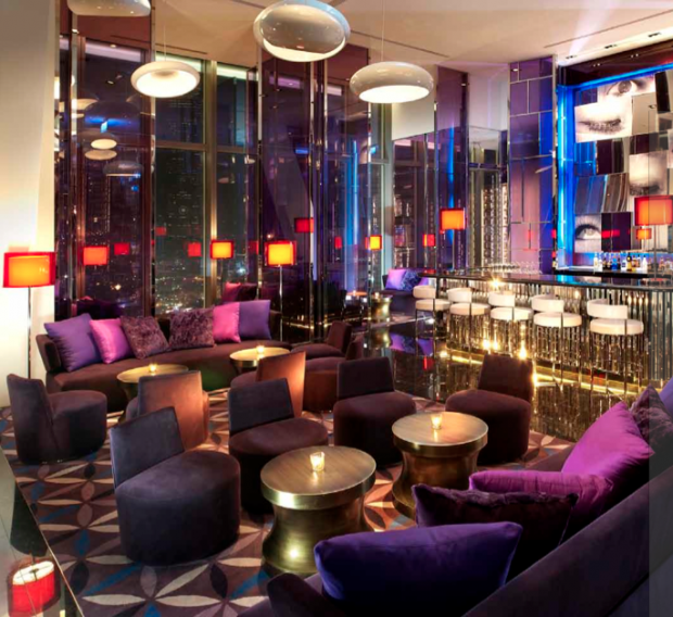
The W Living Room at night is transformed into W’s WOOBAR. The WOOBAR is equipped with over sized ottomans, lounge chairs, sofas and cocktail tables spread out across the space. At the end of the bar is a DJ Island which is home to W’s Resident DJ and other world-class DJs who control the state-of-the-art sound and light systems integrated into the design – the perfect place to see and be seen.  Connected to the Living Room and the WOOBAR is WET and the WETBAR, both surrounding a pool integrated with underwater speakers below and a rich foliage on land. At the edge of the pool, a striking metal bubble sculpture looms evoking suspended, silver droplets of water, while reflecting in its bubbles the W Hotel Building whose character changes at night when the lights illuminate.

W’s electrifying yet cozy Living Room turns into the WOOBAR at night. A kinetic series of timber louvers form a stepped canopy, folding down to enclose the second story meeting areas

The Kitchen Table’s modern interpretation of yellow interiors and patterned ceiling emits the feeling of the sun’s warmth and glow in a garden cottage every morning.   Everyday, the Kitchen Table is filled with a fantastic breakfast spread that it quite reminiscent of our own kitchen table at home. The spread that morning was filled with a smorgasbord of food.  I personally enjoyed the Mac and Cheese as well as everything that had truffle on it!

Next Gary welcomed us into Sweat Fitness Center, W’s Signature Gym and W’s Away Spa and Sauna.  What amazed us was how W was how consistent the branding of W was.  Every little detail was properly considered and thought of.  In each of their signature spaces, they have a special color for way finding which I thought was very interesting.

On the top most floor, is Yen Restaurant, a Cantonese Restaurant with a spectacular view overlooking Taipei 101, Taipei City and the mountains that stretched beyond.  The restaurant itself was filled with quirky details that were impeccably tied up to the space.  The rich purple colored glass created a mirage of spaces, reflections that brought out a unique identity to the space.  Accented with shades of red, this was not your typical Chinese Fare restaurant.  Another interesting detail was that in certain function rooms and nooks, artists found very clever ways of using kitchen and cooking utensils as the medium of their art pieces.  In one nook, spoons, knives and forks brought to life Chinese warriors standing in attention guarding their own “gateways”.  In another function room, cookie cutters were used to create a stunning backdrop amidst the colorful yet classy interiors of the room.  Still in another room, there was an art piece that was composed of chopsticks and teacups arranged in a modern and very interesting way. I enjoyed looking at every art piece because each was a statement piece that was still traditional but at the same time was able to veer away from the usual and the common – which is what we also try to do in our Architectural Design Practice.

The YEN BAR Located on the top most floor, offers the most captivating views of Taipei City as well as the Yangmingshan Mountain Ranges surrounding it

To cap off our tour, Gary treated us to W Signature Drinks at the Yen Bar and showed us the best seat in the house over looking the full height of Taipei 101.  As architects, this was an added bonus to the tour.  At lunch time, we already started Happy Hour.  We had two of W’s Signature Cocktail Drinks.  I had a Green Tea Mojito  and Jason an Oolong Tea Infused Vodka Fizz Cocktail.

The service at W Taipei is also superb.  After the tour, we asked Gary where we could go around the city and he was gracious enough to point out that there was a Red Dot Exhibit and Design Expo just around the corner.  We headed out and spent the whole afternoon.  Turns out, it was an old factory that was converted into a museum and expo space and to top it all off, it was situated beside the new Eslite Mall which was another design haven for us.  After heading to the local night market we headed back to the Hotel and we found a note from Joyce Hsu, W Insider of W Taipei with three test tubes of M&M’s almonds and macadamia nuts.  Joyce graciously extended to us her warm welcome and noted that if there was anything else around the city we’d like to visit we can just ask her – “Wherever, Whenever, Just Ask” was her closing statement.  We loved how personal the service of the W Team was during our visit and we felt like we weren’t very far away from home.

Truly, W Taipei is a rich experience in itself.  At the end of our trip, we were inspired and bursting with design ideas.  It was a sensory experience that allowed us to recharge and get excited to push contemporary architecture to its limits once more.

For more information on W Taipei, please visit www.whotels.com/taipei.

PMBBL on Green Living, ANC

August 19, 2014

One of the first competitions we joined was the “Pinakamagandang Bahay Sa Balat Ng Lupa” Competition way back in 2009, which was launched by Lafarge Cement Philippines and the University of the Philippines College of Architecture. A national open competition, it  challenged Filipino architects to submit blueprints featuring new concepts of what makes a magandang bahay (beautiful house) that takes into account adaptability to the local climate and lifestyle, while keeping the cost to build relatively low. Out of 79 entries, we won and bested the other firms with a design reflecting the Filipino’s creative spirit.

It was a long journey before we actually saw our concept in fruition. There were a lot of administrative problems between the organizers (Lafarge was to donate the structure to UP, who owns the land) as far as who was going to handle and manage the project, finances, etc, among other things. But in November 2013, we finally broke ground for the project with our partners (Lafarge, U.P. Diliman, Wilcon Builders, Icon Builders, among others)

Finally, in June 2014, after a quick 4 months of construction, we finally inaugurated the building along with the stakeholders and prime movers of the project. Sharing with you guys a TV feature of the event, as seen on Green Living, on Channel ANC (ABS CBN News Channel).

Enjoy!

Here’s a link to an article in 2009 about our winning entry. – Philippine Star Article in 2009

Here’s an article of the inauguration in Business Mirror Newspaper.

And a link to Lafarge’s website explaining the competition. La Farge Website Article


The Mystery of Stonehenge

June 21, 2014

Text and Photos by Nikki Boncan- Buensalido , As seen in Urban Monologues 2.0, Business Mirror Newspaper (2014)

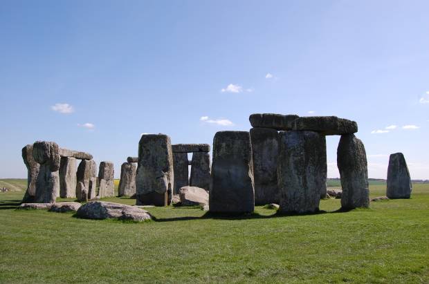
Welcome to History of Architecture 101. In one of my recent trips, I got to the chance to visit Stonehenge, located in Wiltshire, England amongst the Salisbury Plain.  It is an ancient structure that still boggles the minds of historians and locals alike.  Stonehenge is considered to be one of the wonders of the world and is the best-known, prehistoric monument in Europe.  Its post and lintel construction has paved the way for the modern column and beam type of construction as well as the jointing systems we currently use.

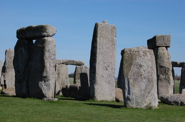
Detail of Tenon and Mortise – The joint systems on the stones were carved out perfectly using deer antlers and bone

Stonehenge’s architecture and methods of construction are basic today but so complex at the time it was built.  It was produced in a culture that left no written records which leads to various imaginative theories.  Historians are still unsure of how the Blue Stones got to where they are now considering that these originated from the Perseli mountain 240 miles away from the current site.  Not to mention that most part of the journey of the 40-50-tonne stones included a trip which crossed waters and scaled a river.  Methods of construction and how the stones were transported, carried, carved, measured and laid out have been studied and theories began to pop up but up to this day, no one knows for sure.  This is what makes Stonehenge so extraordinarily ordinary.

What started out as a simple earthwork enclosure turned out to be the most complex, comprehensive stone structures of the pre-historic times.  It was built in stages that spanned centuries apart in three phases in which all phases required more that thirty million hours of labor.  Historians date the structure back to the late Neolithic period around 2500 BC.  Stonehenge was an important structure in the Bronze Age as later on revealed by the burials mounds surrounding it when artifacts suck as drinking vessels and pottery relating to that period were discovered around the area.

It has been said that Stonehenge was built for various purposes.  One story relates that it was built by aliens because of the way the circles are perfectly laid out.  Others say that it was built by locals who revered the land and used it to be a memorial and a human sacrifice site.  Around Stonehenge to this date, there are hundreds of barrows otherwise known as burial mounds scattered.  This area is considered to be sacred ground as it is a burial site made for the well-known people of the ancient village.  Still others theorize that Stonehenge is an ancient real time calendar laid out in a perfect circle, which maps out seasons, equinoxes and solstices.  Thus it was also regarded as a place of worship and the celebration of the Summer Solstice.

The Stonehenge Circle – The Blue Stones, Heel Stones, Station Stones, Altar Stones and the Five Trilithons of Sarsen Stones is what makes up the circles of Stonehenge. This is the remains of the prehistoric structure to date

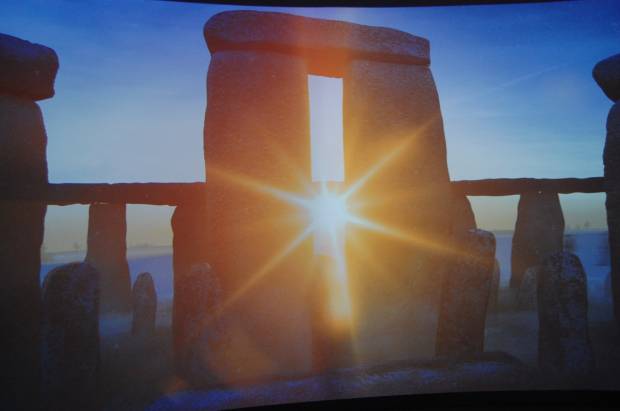
The Summer solstice usually occurs between June 20 and 22.  Also known as the “Midsummer”, it is during this time that the axis of the Earth is tilted toward the sun.  It is also at this point of the year that the sun reaches its highest point in the sky as seen from the north and the south pole. On Solstice day, people in the northern hemisphere experience the longest period of daylight in a year.  In the polar regions however, daylight during the Solstice season is continuous for weeks to even months. People usually flock to Stonehenge at this time of the year because the solstice sun sits perfectly in between the horseshoe shaped stones, other wise known as a trilithon – two vertical stones capped by a horizontal lintel.  In the ancient world, the alignment of the sun to a certain stone marker was a sign that the seasons were about to change or that it was time to plant and harvest crops. On the site even sits an arrow and a Heel Stone marker that points to the true north which probably helped determine how far away the sun was from the north and most likely what season was coming. At summer solstice an observer standing within the stone circle, looking north-east through the entrance, would see the sun rise above the Heel Stone.  What a feeling it must be to witness this natural phenomenon!

Trilithon on Solstice – This is how the Solstice is celebrated every year during the Midsummer festival. The Sun sits directly at the center and in between a Trilithion. This scene informed the ancient people that the Summer Solstice was above head

Today, the government of the United Kingdom has gone through a very extensive program that helps intervene the destruction and decay of Stonehenge for over a period of 5,000 years. Sarsen Stones, Blue Stones, the Trilithons and Heel Stones are typical  parts of the monument.  These stones have various functions and characteristics.  Although some over turned, the government has done a lot to preserve the stones that act as markers and speak a certain language to the prehistoric people.

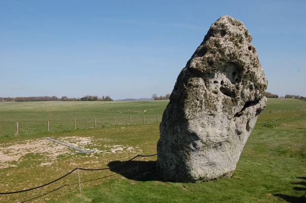
The Heel Stone and Arrow – The Heel Stone is a single block of Sarsen Stone tilted at 27 degrees, standing near the entrance to Stonehenge. It is a marker that points toward the north-east direction. Notice the arrow that also points to a certain point toward the horizon

What also quite interesting to note is the earthwork, surrounding the Stonehenge, are circular ditches on the earth that seem to close in on the monument.  In the middle of the ditch lies the Stonehenge monument itself. A lot of the stones have fallen and have been eroded but a portion of the structure still stands to tell the story.  What is even more interesting to point out is the impeccable detail that was put in to build the structure.  Locks were carved out on the stones which acted like mortise and tenons joints. To make it fit like a puzzle, some stone had tongue and grooves to their sides which helped the stone stay together longer.    It was very well thought of and perfectly executed.  How this was done so perfectly still remains a mystery to this day.  Local artifacts found on excavation sites reveal that tools such as bone and deer antlers were used to carve out these jointing systems.

I never thought I would set foot on Stonehenge but on that day, oh, how I felt the images of my history books come alive. Images in black and white popped out in full color, my five senses taking in all it could.  I almost didn’t want to take the Stonehenge trip because after all, it was “just a pile of rocks” but after experiencing the place in its context, and listening to the rich history of the place, it was a sight to see.  It was amazing enough to catch my attention during the first day of Architecture History class but it was even more spectacular to see it in person.

I was in awe to see how perfectly laid out the stone were and the details that I was able to take in from that simple piece of construction was well worth the trip.  I can almost imagine how it was like to experience the solstice using this prehistoric calendar.  I am left wondering how it must feel like to be there to witness the sun align perfectly in between the stones and how the prehistoric calendar, dating to about 5,000 years still seems to work without fail.  I intently took a stroll around the whole circle taking in every angle and detail, studying the stones and how they were laid out.  I was so blessed to have experienced this enigma to humanity that has stood out for thousands of years.

CitizenM = Citizen Mobile

June 7, 2014

Text and Photos by Nikki Boncan- Buensalido , As seen in Urban Monologues 2.0, Business Mirror Newspaper (2014)

“To all travelers long and short haul.  To the weary, the wise and the bleary-eyed.  To the suits, weekenders, fashion baggers and affair- havers.  To the explorers, adventurers and dreamers.  To all locals of the world from Amsterdam, Boston and Cairo to Zagreb.  To all who travel the world with wide eyes and big hearts.  To all who are independent yet united in a desire for positive traveling.  To those who are smarter than a dolphin with a university degree and realize you can have luxury for not too much cash.  To those who need a good bed, a cold drink and big fluffy towels.  To all who are mobile citizens of the world.  Citizen M welcomes you all.” This is wall mural is what greets you first at the interactive, designer chic self-service check-in counter at citizenM.  The philosophy of citizemM (or Citizen Mobile) is enough to hold a first impression and make it last.
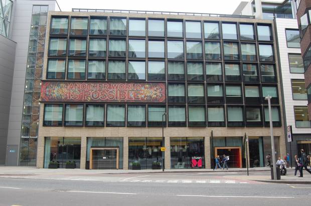
CitizenM’s building exterior blends in with the surroundings save for a few pull out box windows and the signage that says “Another World is Possible.” Strong statement.

I first heard of citizenM at the World Architecture Festival in Singapore last year. It won the World Architecture Award for Hotel and Leisure.  Designed by Amsterdam based firm Conrete Architectural Associates, citizenM is a Dutch hotel group that opened their first hotel at the Schiphol Airport in Amsterdam in 2008. Today, the hotel chain has expanded to Glasgow, Rotterdam, London, New York and soon, Paris.

CitizenM offers mobile citizens of the world affordable luxury in the heart of the city.  They were able to carry forth this vision by stripping the hotel off all hidden costs and unnecessary items but at the same time, provide a luxurious atmosphere throughout the hotel for a very affordable price.

My latest adventure was a quick trip to London with my husband and we decided to try citizenM as our home away from home.  Right in the middle of Southwark’s neighborhood, quietly stands citizenM.  The building’s exterior does not scream out and take attention away from the neighborhood but a designer will get a feel of its quirkiness in the smallest details such as the simple play of the façade windows and the signage.  The lobby however is a different story.  As soon as you enter the building, a new world opens up and envelopes you right away.  Everything in the lobby was a sensorial FEAST! It blasted out colors, shapes, sizes, information, emotion, movement, warmth, comfort – name it, you could almost taste the vibe!
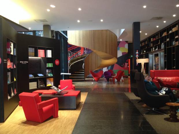
Upon entry into the building’s double doors, this is the sight that greets you. Oh, how my eyes lit up with all the color, designer furniture and shapes inside this space! The curve of the spiral staircase blends with the contours of the Heart Cone Chairs designed by Verner Panton for Vitra.

The lobby was very welcoming.  It had a lot of colors and objects but it all came together coherently.  It was very well planned and organized to be one big space separated by elements that tied the whole thing together.  Right when you enter, a huge and expressive spiral staircase greets visitors at the end of the lobby surrounded by various chairs from well-known modern furniture company Vitra.  The lobby, living room space, and food and beverage space complete with a bar and tables for eating or workstations tastefully fill the room. The public areas of the hotel are divided into different environments for work, socializing, relaxing and even to grab a local draught beer from the tap. Different designer furniture pieces formed vignettes throughout the space providing for ample seating and an extremely cozy atmosphere.  Choices for the use of the lobby alone are endless – from a cozy fireplace all the way to a stylish café – you name it.
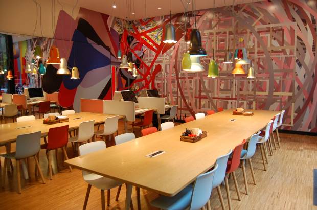
At citizenM, everyone is treated equally. Designed by the Bouroullec Brothers for Vitra, the dining tables and chairs against the mural backdrop, mirrors and mixed-matched complemented each other. What a way to start breakfast each day!


The lobby extends to an outdoor living room in the form of the courtyard.  The courtyard in the middle of the space breaks the sudden bursts of energy.  It acts as a beautiful oasis in the heart of the hotel and supplies natural light into the rooms above.  The courtyard is also surrounded by terraces that are accessible from every floor which can be used for intimate outdoor get-togethers, drinks or simply to just inhale the fresh air.  The hotel is also equipped with various meeting rooms that are accessible to the public.  SocietyM, the public life of the hotel offers designer meeting rooms which are also fully equipped with WiFi and other gadgets for hip and happening business meetings.

The lobby is also equipped with canteenM, a 24/7pit-stop for hungry citizens for breakfast, lunch, cocktails, dinner and after dinner booze.  Sushi, Signature sandwiches, warm dishes and a dozen drinks are available at any time.  I had a pint of local black beer brewed with dark roasted barley and a hint of freshly ground Arabica coffee beans. Describing it again makes my mouth water! It tasted like heaven

The hotel has five more floors to accommodate guest rooms.  Guest rooms are all the same as they treat everyone equally – there is only one size for the rooms all equipped with an XL King Sized bed.  That’s 2.2 meters x 2.0 meters.  I was literally swimming on the bed.  All rooms also welcomed each guest personally as our names were flashing on the TV Screen when we entered the room.  The rest of the room is small but very well planned and functional.  Upon entry to the room on the right, a capsule that changes colors via LED lights welcome you.  The capsule is the bathroom which is also equipped with a rain shower and personalized shampoo holders.  I loved every detail of the welcome process because it felt as if someone was really talking to us.  There were small signs casually explaining the purpose of everything inside the room.  The room even came with a tablet that can control all the switches of the room from the curtains and roller shades, to the TV, to the air-conditioning and the lights.  You can even control the color of the lights from the tablet.  The room also features luxurious bed and bath linen, international plug systems, electronic blinds for the wall to wall windows which gives out enough natural light during the day, and even ambient lighting technology at night.  Vitra Designer Furniture still adorns each and every room.  There were even free movies available for us to watch.  We didn’t want to leave the room!
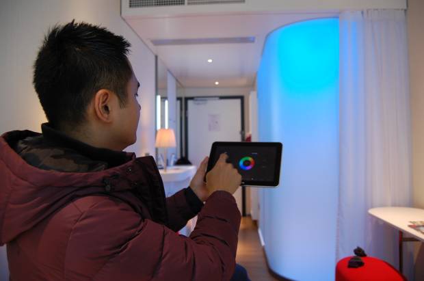
 

The entire room can be controlled by a touch screen tablet. You can control the lights, the mood of the room, the media console (complete with a movie library and a virtual DJ booth) and the roller shades too!


The Hotel Staff is one of the most dynamic, diverse and friendliest bunch of people we met on the trip.  They come from different countries but seem to share a certain passion and love for design and the hotel.  They all have big hearts with different stories to tell.  On our last day, we met Enrique who originally hails from Spain and Eylem from Turkey who were both on duty as we arranged our transfers to the airport.  They were warm and they made me want to stay on.   What I liked the most was when Eylem shared that the hotel also exists to create memories and they would like to help create memories in every way possible to the best of their abilities.

As we did our self-check out the machine said good-bye after completing all the steps and wished us “safe travels wherever your next destination shall be.”
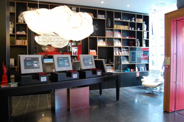
The Self- Service check-in counters are efficiently programmed. What set this apart from the other self-check in service computers is that somehow, they managed to still make the welcome feel personal coming from a machine. Hovering above the computers is a Mamma Cloud P Lamp designed by famous architect Frank Gehry also for Vitra

The hotel is truly a design haven and an oasis for youthful, adventurous travelers and businessmen alike.  The structure is simple and the flow of the space efficiently planned.  Infused with bursts of vibrant color and designer furniture plus open spaces, its impact on my memory is something that will not be quickly erased.  It leaves an atmosphere that makes people happy and feel good about themselves and their environment. It is definitely a place to re-charge a creative mind and to inhale inspiration and new ideas.

To learn more about the other features of CitizenM Bankside in London, click here: http://citizenm-cms-l.cloudapp.net/destinations/london/london-bankside-hotel

I wonder where our next adventure will lead us.

S House in Urban Zone

May 10, 2014

Sharing with you guys our latest completed residential project, S House, as featured in Daphne Osena-Paez’ webisode of Urban Zone. Thank you Daphne for providing a platform for us to share our ideas and spread our ideas on “Filipino Rennaisance”. Mabuhay!


Designing houses in the Philippines can be frustrating a lot of times for us. Since we practice contextual architecture, we do not believe in ‘themed’ residenial developments but instead believe in an architecture that is designed specifically for the place its going to be built, the climate there, and should reflect the culture and identity of the people using it. For this project, for instance, the lot is located within a strictly Mediterranean-themed development. We understand the whole point of having rules and restrictions in a subdivision which is essentially to achieve harmony within it. But since the village had a mediterranean theme, and houses there had little or no eaves, we were being restricted to have a maximum of half a meter for our eaves! This doesn’t make sense at all in a tropical climate because we need eaves and canopies and different architectural contraptions to be as long as they can be to protect our fenestrations from heat and rain (which happens to hit the house horizontally when combined with strong winds).
We essentially designed the house as if we weren’t governed by the theme. We designed it to be honest to it’s site, climate, condition, and client’s pramaters. We started off with the idea that as an owner or designer of a private house, we will never have control over the urban condition that surrounds our property. One day, it may look good, the next day, it may deteriorate because of lack of maintenance. The theme of the village, for example is something we cannot control, more so the attempt of the other homeowners to build a Mediterranean house but most often ending up wth a very poor and tacky copy.
Given this fact, we proposed a house that’s defensive. A house that’s inward looking, and whose back is faced towards the street, and whose spaces all are oriented towards it’s own controlled environment, in this case a courtyard in the heart of the house. By doing this, the spaces between the street and the courtyard become transitory barriers that protect the controlled environment within from being degraded by the uncontrollable harshness that our urban jungle creates such as noise from traffic, pollution, undesireable views, etc.  We used public spaces such as circulation areas as visual and auditory buffers that protect the private spaces from the outside world.

We proposed a house with projecting canopies to ensure the interiors from direct heat gain. We realized that if we push back the building line a bit back relative to the allowable building line, we can have longer eaves and canopies. In combination with this, we made sure that cross ventilation occurs throughout the house. The plans of the house are not deep, therefore making it easy for wind to exit through another opening as soon as it enters.  Even walls that open up to an internal hallway have transom windows, to allow wind to cut through. There is no room in the house whose windows are only on one wall effectibely funneling the wind to cut across the entire length of all rooms.

We proposed a house whose general form is still oriented towards the courtyard, articulated with a series of walls that act as if they were hugging and shielding the internal environment of the house from the outside world, made even more expressive by arraying these fins in shifting angles.

We proposed a house that is honest with its materiality – concrete is shown as concrete – raw and unpainted. Wood is shown with all of its grains and knots. Glass is kept as transparent as it can be. The imperfections of all of these materials remain unhidden.

We took a chance on the design as we believed that it represented the client’s preferences, and the cleint ended up believing in the design so much as well. We submitted the plans to the subdivision with our fingers crossed. Despite the theme,  and with a little push and a bit of argument, we had the design approved. Ever since it was built, the village has now been revising their regulations. The mediteranean theme has slowly been eased out as they realized that it was only a market-driven trend and there are now lesser and lesser people wanting to buld their house in such theme, especially after seeing that an honest house can turn out to be much more beautiful and expressive of who they are than themes that developers set. To cause things to change for the better, some rules should really be aimed to be broken.

Exploring the Urban Fabric

February 10, 2014

Text and Photos by Nikki Boncan- Buensalido , As seen in Urban Monologues 2.0, Business Mirror Newspaper (2013)


Last year, I had the chance to visit Seattle in the US.  My family and I took a 3-hour road trip from Vancouver, Canada to the border of Washington State in the US.  It was my first time in Seattle and I read from books that it was a gloomy city – always raining and cloudy.  Records of the local weather bureau point out that Seattle is ranked as one of the five States that receives the most amount of rainfall in a year.  This was what I was expecting and was prepared to get soaked but as we drove into the border, we were greeted by a warm and very fair day with wisps of clouds in the sky with the afternoon sun preparing to set in the horizon.  It was a pleasant surprise and I was excited because I only had 24 hours to soak in all the Architecture and the local flavor of the City. As dusk set in, we were driving into the curb of the apartment of one of our family friends, Cassie Lim.  Tita Cassie, graciously invited us to stay with her for the night and offered to take us around the city in the morning.

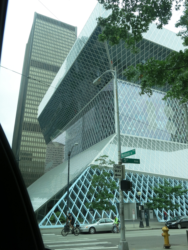
Being an architect, all the items on my Seattle Bucket List were all modern buildings.  After our first stop at the Pike Market to pick up our early morning breakfast at the very first branch of Starbucks, we headed towards the Seattle Central Library which opened in 2004.  The Central Library is the flagship building of the Seattle Public Library System and was designed by world-renowned architect Rem Koolhaas and Joshua Prince- Ramus of the Office of Metropolitan Architecture or simply OMA.  Right smack in the middle of a normal street with normal buildings, was this very expressive art piece.  As you turn the corner, the first glimpse of the building jolts you alive.  An American Institute of Architecture blog notes that this building was voted 108 on the list of Americans’ 150 favorite structures in the US.  The building also received the 2005 National AIA Honor Award for Architecture. At 11-stories of 56 meters high, the building is made of a diagrid structural system, bare concrete and glass.  The building’s massing is composed of a three structures piled, peeled and pulled off from each other in some angles enveloped a structural system that also acts as the skin of the building.  As if inviting users inside, the architects of the building wanted to allow people to still experience how to use books despite the fact that almost anything can be pulled out of the internet.  Koolhaas and Ramus wanted to make sure the program of the building’s spaces functioned as reading nooks and public spaces recreated as a “Living Room” with light filling in from the outside,  encouraging users read more books and stay lengthily inside the library.  The wanted to create a building that was functional and kinetic rather than static and imposing, which is usually how other old libraries look like.

Right smack in the middle of a normal street with normal buildings, was this very expressive art piece.

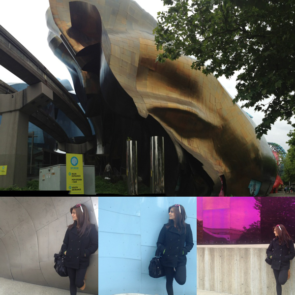
Next stop was the Experience Music Project Museum or the EMP.  The EMP is located in the heart of the Seattle Center Campus where the Seattle Needle can also be found.  The EMP was designed by Architect Frank Gehry. Having been acclaimed for other famous structures such as the Guggenheim Museum in Bilbao and the Walt Disney Concert Hall in Los Angeles, Frank Gehry, another maestro in the world of Modern Architecture.  The EMP Museum is the home to some of the most significant eras of popular culture, science fiction, rock and alternative music.  Similar to its architecture, the museum is dedicated to push risk-taking ideas further so that it can fuel creativity of pop culture further.  The colorful reflective exterior of the building is made up of riveted sheet metal which changes its form as one turns every corner of the building’s façade. Frank Gehry describes the building to take the form of a “smashed up electric guitar”.  Our local guide mentioned that to some local residents, the building is reminiscent of a “crumpled piece of musical score sheet”.  What was interesting too is that the purple side of the structure is inspired by Jimmy Hendrix’s song “Purple Haze”.

Loved the colors all over the facade so I decided to take snap shots in each colored background :)

When I visit architectural landmarks, I make it a point to experience the building on all sides since some have entirely different angles and forms. The details of each particular structure also leave traces as to how the building was constructed and the though process that goes with the design concept. At every turn, the building contorted, bent and cracked to form crevices some of which formed pedestrian entrances and display boards.  There was even a hole in the building to allow the monorail track to slice through!

Sufficient to say that truly, creativity has no limits. Both the Seattle Public Library and the Experience Music Project Museum are notable landmarks in Seattle.  Both carry a distinct identity.  Both are avant-garde, modern and contemporary. The concept of reading and appreciating music is not a new thing.  The Seattle Public Library and the EMP Museum has just found new ways to allow the user to experience reading and listening to music in a new light.  These two buildings have successfully bridged the gap for the elderly and the young by introducing a new and tangible experience.  Both architects used normal elements such as books and music that we are all used to and translated them into something relevant for the current times.  They were able to translate it into something that the younger generation can understand.

Taking these into our local context, I hope that someday, we too can create modern buildings that are responsive to local context and local culture but at the same time these buildings may also allow our people to experience the mundane things in different ways. Allowing them to expand their knowledge based on personal experience is a more effective tool. I invite you to join me as I explore the adventure of life and as I relate a series of observations to dissect what the Urban Fabric contains and to go deeper than just mere aesthetics.

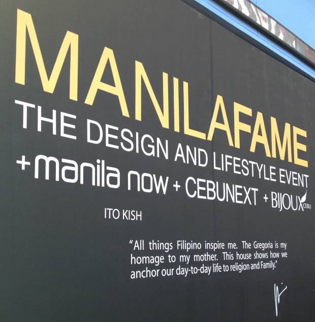
Manila FAME 2012

October 20, 2012

Today, October 20, was the last day of Manila F.A.M.E.

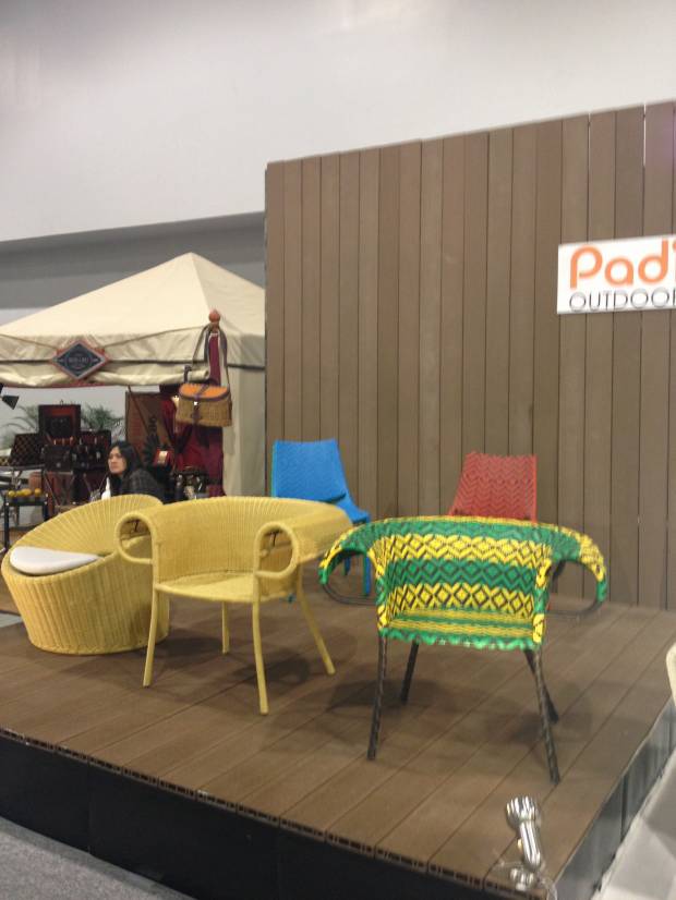
The show this year was very interesting and exciting. We felt pride as we went around and saw the different designs that each booth offered. The whole place was oozing of creativity, originality, and world-class quality. On top of all of these, one of the major themes of this year’s show was to integrate and showcase our Filipino culture everywhere in the venue, while infusing contemporary ideas and interpretations with it. The after effect of this will surely be amazing, as some form of ‘culture revival’ is taking place in the design industry and will surely be wide spread right after F.A.M.E. Filipinos (who usually long for Western culture) will now realize that cultural manifestations of our nation, if interpreted in contemporary way, will attain a renewed identity – something that can definitely compete globally.

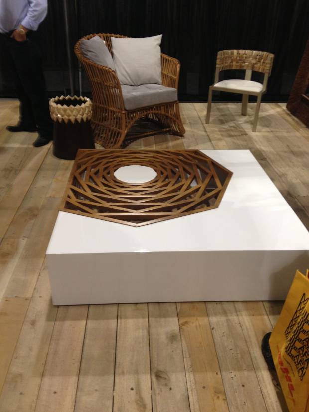
Here are some snapshots of our rounds.

Manila FAME, curated by my friend Ito Kish!


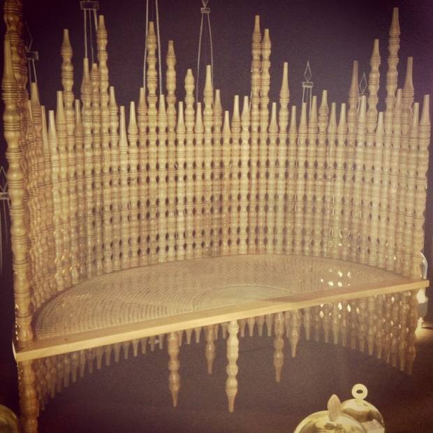
The Gregoria, by Ito Kish. Last year's winner for best furniture design. The piece is a tribute to his mom. Fabulous in actual!


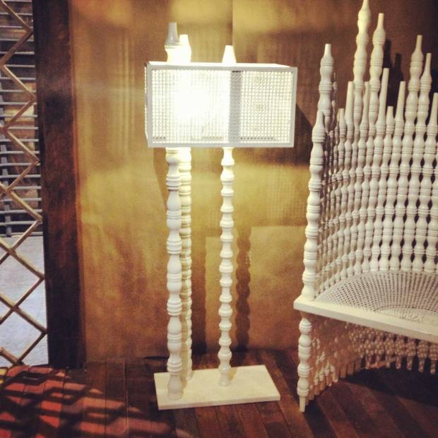
A new release by Ito Kish too. Spin-off floor lamp from the Gregoria.

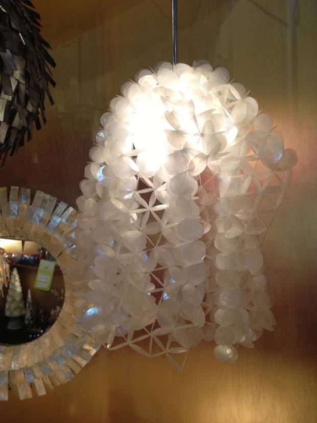
A tesselated lamp design from Robles Heritage made in Capiz. Interesting!


Color seems to be popping up more now.

Center Table by Vito Selma


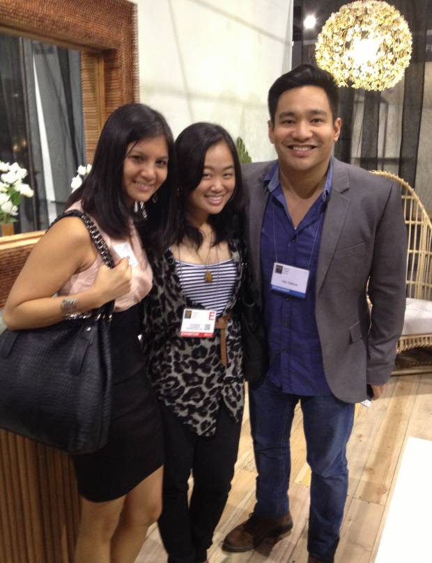
Nikki Boncan-Buensalido, with batchmate Charisse Ong and Vito Selma

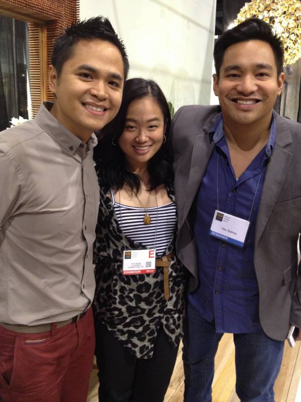
Jason Buensalido with Charisse Ong and Vito Selma

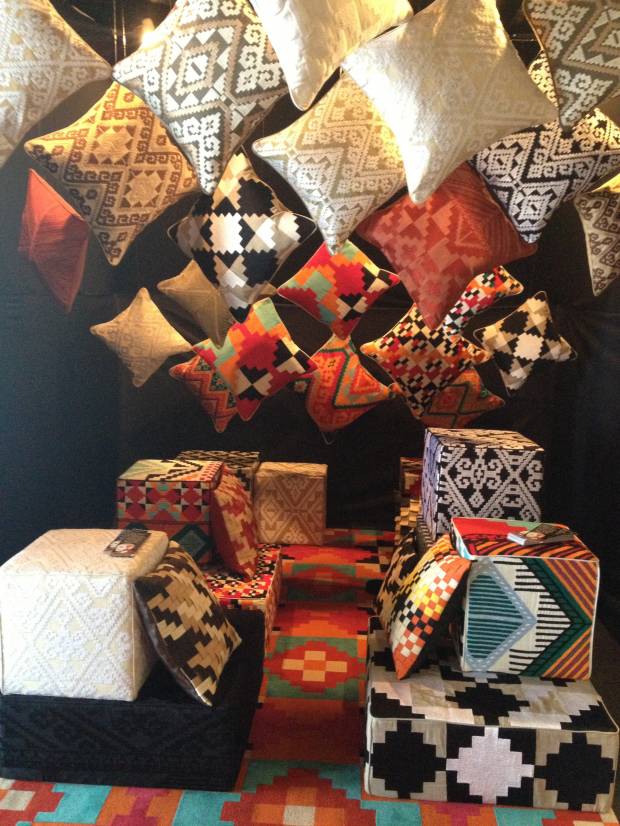
Fabric Designs by Inigo Elizalde for Catalina Embroideries Cebu. Notice how the designs are reminiscent of traditional Filipino weavings. We bought a few for ourselves!

Aktiv Sports – Eastwood

October 20, 2012

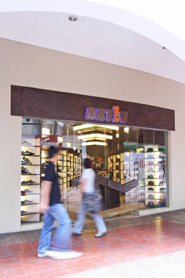
storefront

"all great artists sign their work" - steve jobs

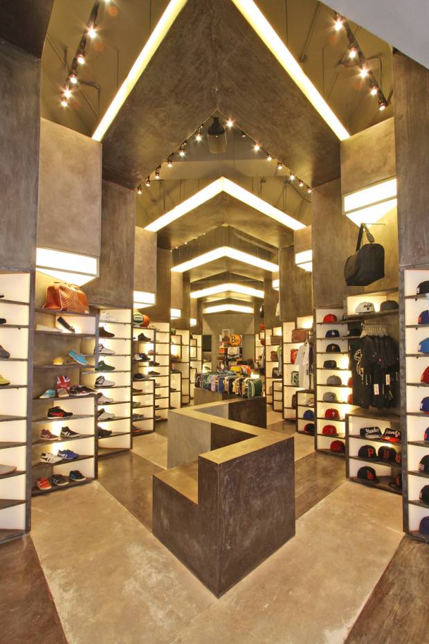
A few months ago, we were comissioned by the Relzbach Group to do a re-vamp of their store. Aptly called AKTIV, its a brand they developed that carries multiple brands under their wing such as Gola, New Era, Hunter, and Buff, among others.

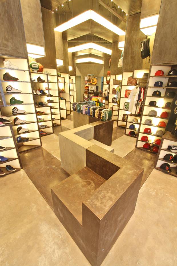
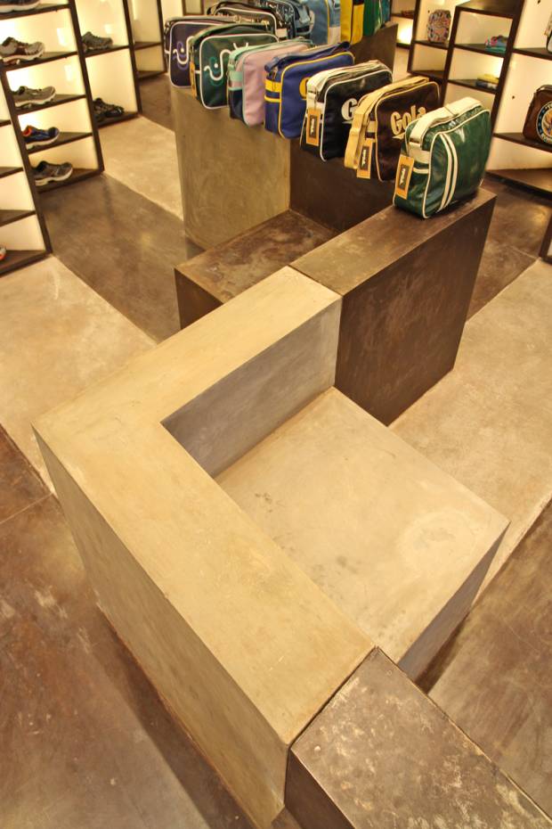
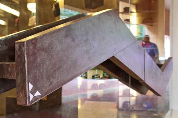
Given all of these multiple brands with identities of their own, the real challenge was how to make the store look harmonious with all of these brands that have their own identities. Our solution was simple – to develop a module that could function in multiple ways as well, so that it could adapt to the specific need of each product. We started with a display shelf whose dimension was based on a shoe – this box is stackable to display multiple shoes, or be adjusted in dimension, to display products with differnet sizes such as bags and shirts. These boxes were also used as light shelves, to illuminate products that are far from the source of light in stores which is usually the ceiling. The boxes could also be used as signage bands – and with this, a certain visual organization was achieved as even if their logos and signages looked different from each other, the similarity of the module size and configuration that houses these logos are the same.

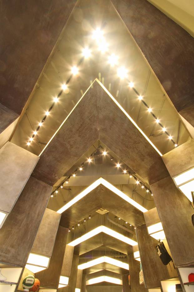
These modules were then rotated in such a way that it faces the storefront for premium visibility, stacked on each other, to form these “toblerone” shaped display modules (as the client fondly called it), that create an even bigger module collectively formed by the boxes. Sort of like an picture (toblerone) formed by pixels (boxes).

Being a store that focuses on an active lifestyle, we wanted to simulate the spirit of movement. By stamping these toblerone shaped modules throughout the perimeter of the store, a certain rhythm was achieved thru repetition, creating a visually appealing and dynamic atmosphere.

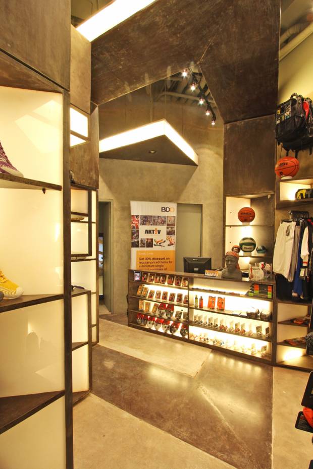
The choice of materials presented much difficulty during construction because of the absence of veneers. Concrete is seen as concrete. Metal is presented as metal. We wanted to achieve a certain kind of rawness in the interiors – the same kind of rawness people feel when they’re active. Call it visual honesty.

the space upon entry

the sales counter

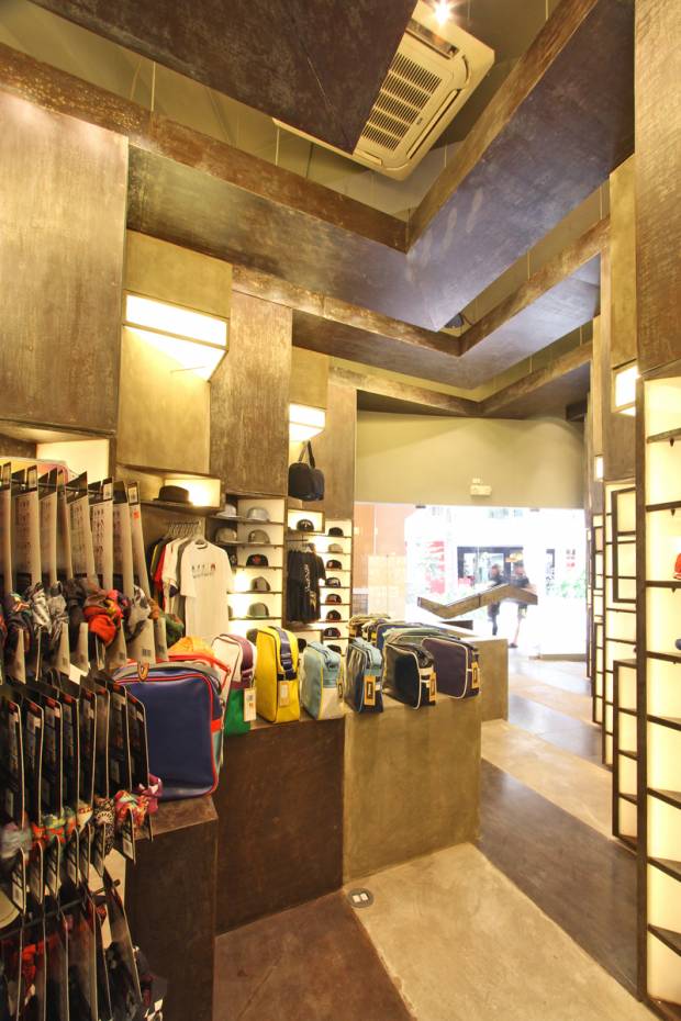
view from the interiors, looking towards the storefront

bench / display

ceiling details - the shape is similar to the AKTIV identity


‘The House’ Project, featured in globally renowned websites!

August 25, 2012

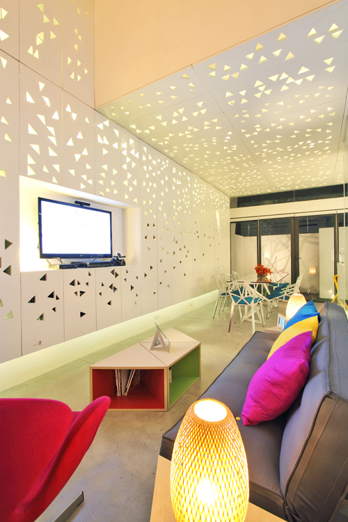
Interiors of 'The House' Project

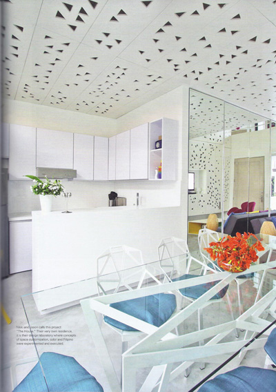
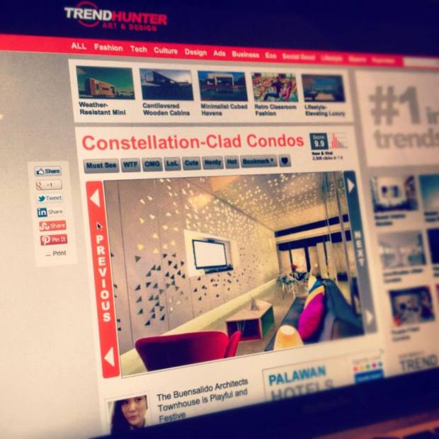
This week has been such a great week for us, specifically for ‘The House” Project, an interior job that we recently completed which happens to be situated in a townhome complex which we also designed. It first came out in trendhunter.com, one of the widely read website that focuses on whatever is the latest on art and design.

Link to ‘The House” Project on Trendhunter.com

'Constellation-Clad Condos', as seen in trendhunter.com

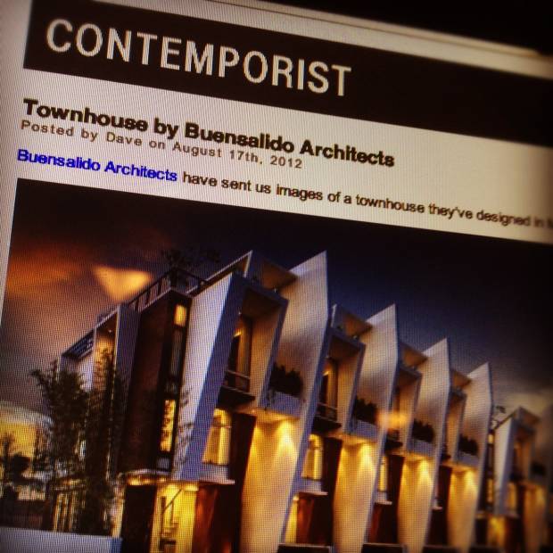
A few days later, it also popped up in Contemporist.com, a leading website when it comes to modern interior, funiture, and architectural design. Though some of our work have already been featured there (Courtyard House, Via Venetto)   we were still so excited to see ‘The House’ Project on this site as it has become a culmination of all our principles and beliefs about how to contemporize Filipino Architecture. Check out the link below:

Link to article in Contemporist.com

Contemporist.com!

One of our goals is really to put back our country in the design map of the world, and we believe that the only way to do that is to stick with our identity and stop trying to be someone else by always desiring archietcture from other countries. Filipino Architecture doesn’t have to be stuck to a literal bahay kubo or a literal copy of a bahay na bato, because there are infinite ways to make it adapt to modern times WHILE reflecting our identity and culture in it. If anyone noticed, NONE of the themed architecture here in our country (Mediterranean, Balinese, Greek, Victorian, etc) have been featured in international design websites. But as soon as there is something distinctly Filipino about the design, it automatically gets recognition – like how Bobby Manosa and Kenneth Cobonpue got international acclaim. That simply means that all we have to do is be honest with who we are, be proud of our identity, make our designs speak about it, and we will be recognized as a strong player in the global design industry.